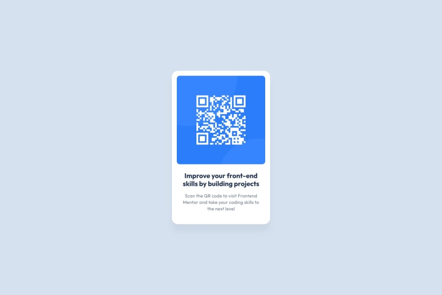
Design comparison
Community feedback
- @ThatDevDiazPosted over 1 year ago
Hey it looks like you got a little bit of extra padding under the qr code. There's a few ways to fix this. You can add padding-bottom to the qr code separating the text below it a little bit further which will make it look like there's less empty space in 1 large block. I would open dev tools and take a look at which element is creating all that empty white space and adjust accordingly using margin/padding or maybe just shrinking the size of the entire container.
Also, I recommend downloading and importing/using local fonts because you never know if a font imported from a link will break. Links change all the time and if it's linked to a google site, any changes can affect the font in future imports. Keeping it locally ensures this won't happen because the font file will always be in the same place.
Good job on the HTML and keeping it simple. I'd probably change the H3 to an H1 and just change the font. Always good to have an H1 in a project file.
Good job!
Marked as helpful0@Davidbassey01Posted over 1 year agoThank you for the help. Mych appreciated. Helped a lot. @ThatDevDiaz
0
Please log in to post a comment
Log in with GitHubJoin our Discord community
Join thousands of Frontend Mentor community members taking the challenges, sharing resources, helping each other, and chatting about all things front-end!
Join our Discord
