Not Found
Not Found
Not Found
Not Found
Not Found
Not Found
Not Found
Not Found
Not Found
Not Found
Not Found
Not Found
Not Found
Not Found
Not Found
Not Found
Not Found
Not Found
Not Found
Not Found

Submitted

Semantic HTML, CSS

P

@JamesLaviron

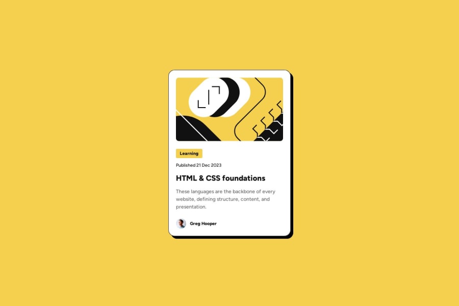
Desktop design screenshot for the Blog preview card coding challenge

This is a solution for...

  • HTML
  • CSS
1newbie
View challenge

Design comparison


SolutionDesign

Solution retrospective


What are you most proud of, and what would you do differently next time?

I'm proud of the way i tried to optimize my code considering last project issues.

What challenges did you encounter, and how did you overcome them?

I was challenged by the understanding of Figma designs. I mainly had issues with svg.

What specific areas of your project would you like help with?

I would like help in order to work on text reduction on mobile side.

Community feedback

Lance 1,580

@IzykGit

Posted

Good work!

There are two easy ways to make text responsive for mobile. You can use something like font-size: 2vw where the text will respond based on the view-width, or you can use media-queries and manually set the font size at different view widths.

Keep up the good work!

Marked as helpful

0

P

@JamesLaviron

Posted

@IzykGit Thanks for feedback, I decided to use clamp method, seems to work well.

1
omar 30

@Marioomario

Posted

You've done great work, and the design looks good, but there are two things you missed: you forgot to add a solid border to the main container, and you need to make it responsive for mobile phones by adjusting the size as mentioned in the UI design.

0

P

@JamesLaviron

Posted

@MarioomarioThanks for feedback, I corrected my live project. I struggled to understand figma typo settings.

0

Please log in to post a comment

Log in with GitHub
Discord logo

Join our Discord community

Join thousands of Frontend Mentor community members taking the challenges, sharing resources, helping each other, and chatting about all things front-end!

Join our Discord