

Design comparison

Solution retrospective
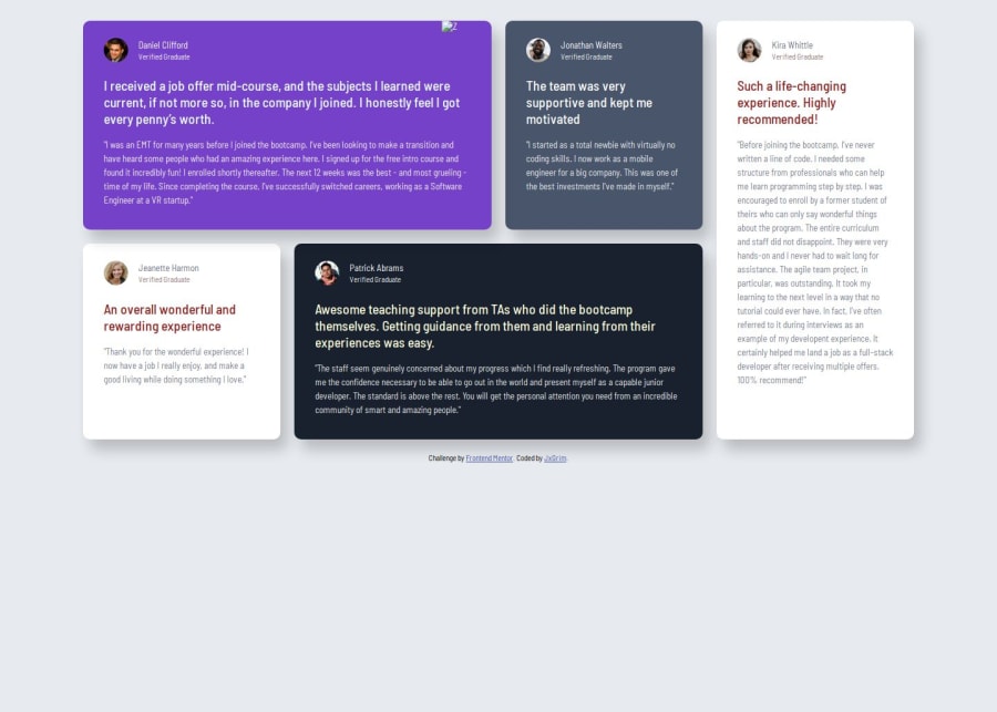
Everything, I was able to make multiple breakpoints to make it not only mobile and desktop responsible, but tablet responsive. The page is actually static though and the height is based on the content, in most boxings, there are no margins just justify content and space-between. If content is less or more, the spaces correct acting as margin might get cramped with text. Note edit the context, so we are fine. haha
What challenges did you encounter, and how did you overcome them?Breakpoints, that was though main. I just had to use personal breakpoints which are closed to standard breakpoints. 576px is not min-width for mobile desktop. it goes up to about 660px.
What specific areas of your project would you like help with?None for now. I am all good man.
Community feedback
- P@jayco01Posted about 1 month ago
I noticed that the text on the cards with a white background is a bit hard to read. The light text color blends into the background, making it difficult to focus on the content.
Suggested Solution
To improve readability, you could change the text color on the white background cards to something darker for better contrast. There's no need to change the text color on the other boxes, just the ones with a white background.
0P@jayco01Posted about 1 month agoAlso, I just wanted to say it's really impressive that you managed to build this entire layout using only Flexbox. That seems really hard, especially with a more complex design like this. But, learning CSS Grid could be a great next step. Grid is designed for two-dimensional layouts and could make your CSS more efficient and easier to maintain. It will simplify defining rows and columns, reducing the need for multiple nested containers and complex Flexbox tweaks. Plus, it usually results in cleaner, more readable code for layouts like this.
Just something to consider for future projects. I think it could make your development process even smoother.
Marked as helpful0@AJsemPosted about 1 month ago@jayco01 Yeah, I actually have that video next as the last on my css course. Just wanted to gain more knowledge on flex. Anyways, after reading what you wrote, I think I am all good to move to grid now. Thanks bro...
0

Please log in to post a comment
Log in with GitHubJoin our Discord community
Join thousands of Frontend Mentor community members taking the challenges, sharing resources, helping each other, and chatting about all things front-end!
Join our Discord