Design comparison
Solution retrospective
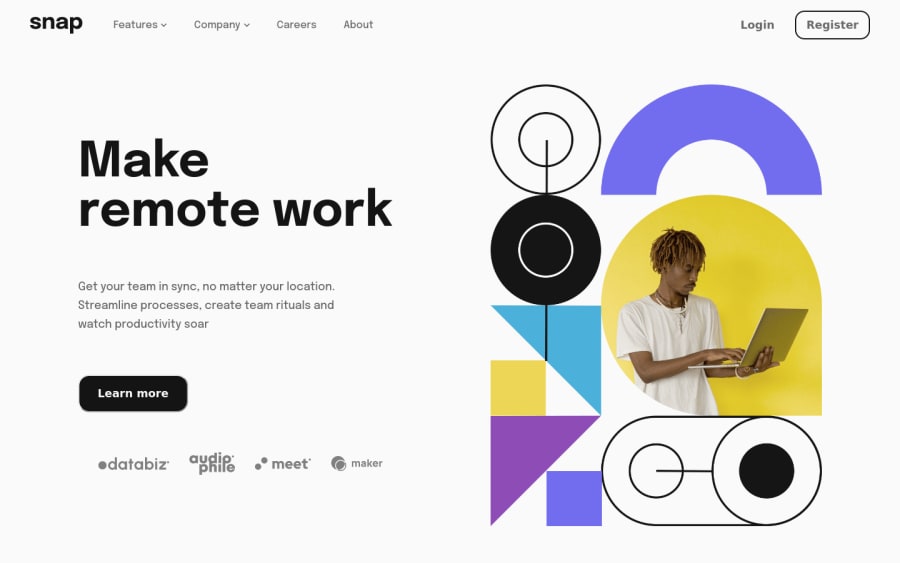
Oooh boy, i really liked to make this one. Making a responsive navbar has been on my list forever, but i couldn't get a nice Incentive to make it, but now? It's done!
I run into several difficulties along the way, a couple of them were:
- How to properly structure the HTML tags? Should i use lists and lists item for navbar links? Should i put buttons inside lists or make them different components?
- Making the main content with flexbox was a challenge, i spend a couple of minutes trying to fit the hero image but it would aways overflow and take all it's original resolution. The only way i could address this issue was to wrap the picture tag with an parent div, set is max-size to whatever size i wanted and then setting the imgs size to 100%. I don't know if there is a better way to handle big images...
- Issues regarding transitions and animations. I tried to animate a couple of components like the dropdown menu, but, as this is a new thing to me, it didn't worked well lol.
I would love to receive as much feedback as possible <3 Thank you!!!
It might be my last vanilla html-css-js project as i'm loving to make things with react, scss and styled components.
Community feedback
- @FahatmahPosted over 2 years ago
Hello Lucas! Great work! The second and last also happened to me but I just let that way 😄 About the hero image, we almost have the same approach as I made an image wrapper then set a
max-widthon it then the image will be 100% of its width.For the use of tags, I think it would be better if you use
divtag rather than anotherulinside ofliwhich has a parent oful. When I did that ul, I ran into issues such as hovering links. This is all 😅Marked as helpful1
Please log in to post a comment
Log in with GitHubJoin our Discord community
Join thousands of Frontend Mentor community members taking the challenges, sharing resources, helping each other, and chatting about all things front-end!
Join our Discord
