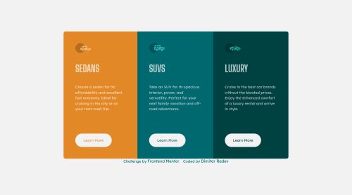
Submitted almost 3 years agoA solution to the 3-column preview card component challenge
Second take on Mobile First 3-Column Preview Card Component
@Mitko90

Solution retrospective
This is my second take on this challenge with a few changes.
Here's what I've changed:
- Removed the
articleelement from the page after I was told it was being used incorrectly. - Changed my
h1headings toh2as it can be reused. - Added a visually hidden
h1title so I don't get accessibility warnings. - Changed my
<button class="btn">to<a href="#" class="btn">as these buttons are supposed to be directing viewers to different parts of the site. - I changed the
pxvalue in my@mediatoemfor improved accessibility.
A big Thank you to @vcarames for all the suggested changes on how to improve my coding.
As always all feedback is welcome and I'm grateful to everyone who takes the time to view and correct my code.
Code
Loading...
Please log in to post a comment
Log in with GitHubCommunity feedback
No feedback yet. Be the first to give feedback on Dimitar Radev's solution.
Join our Discord community
Join thousands of Frontend Mentor community members taking the challenges, sharing resources, helping each other, and chatting about all things front-end!
Join our Discord