Design comparison
SolutionDesign
Solution retrospective
This was a fun challenge 🤠
I'm not really sure if the quotes in my HTML are used properly.
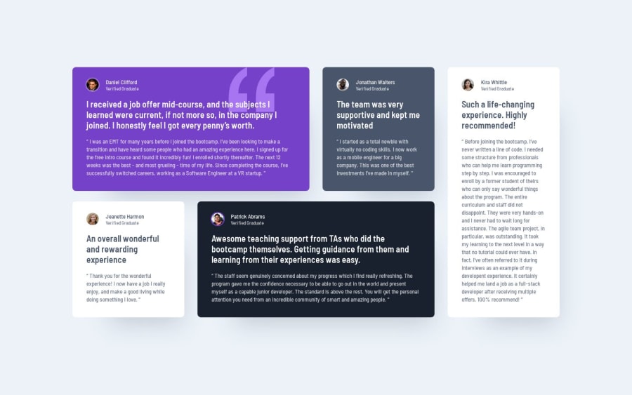
- I added an additional breakpoint for tablet view
- This is pretty much the first challenge where I used a proper Sass mixin to color the cards 👨🏼🔬
- I didn't use as much opacity on the text as the design suggested because of contrast problems
Community feedback
Please log in to post a comment
Log in with GitHubJoin our Discord community
Join thousands of Frontend Mentor community members taking the challenges, sharing resources, helping each other, and chatting about all things front-end!
Join our Discord
