

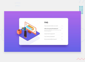
Design comparison

Solution retrospective
I would like comments on my styling. I couldn't make the shadow display properly on desktop view. I would also like comments on my use of HTML. I don't think I use the right syntax. Thank you.
Community feedback
- @avinashdvPosted about 2 years ago
Hi, Nice work. I think you are a little confused with media queries, I would advise a few points that could make the website responsive, please consider these changes.
The below media query states that all the devices that starts from 375px. we can consider 426px instead of 375 as modern mobiles width is much higher than 375px. @media only screen and (min-width: 375px)
Change it to @media only screen and (min-width: 426px) All the code that we write in this media query will get applied to desktop as we stated the min-width 426 and above.
Now for mobile, use @media only screen and (max-width: 426px) All the code that we write inside this will get applied to mobile. It actually states that 0 to max:426 only.
Note: In the starter file, It is given that mobile and desktop as 375px and 1440px. Which therefore means the mobile responsiveness should start from 375px and below, above 375 it should be desktop.
Marked as helpful0@AyodelearogPosted about 2 years ago@avinashdv Thank you so much. So I should only use max-width: 426px for my mobile henceforth?
0 - @AdrianoEscarabotePosted about 2 years ago
Hi Ayodelearog, how are you?
I really liked the result of your project, but I have some tips that I think you will enjoy:
- We have to make sure that all the content is contained in a reference region, designated with HTML5 reference elements or ARIA reference regions.
Example:
native HTML5 reference elements:
<body>
    <header>This is the header</header>
    <nav>This is the nav</nav>
    <main>This is the main</main>
    <footer>This is the footer</footer>
</body>
ARIA best practices call for using native HTML5 reference elements instead of ARIA functions whenever possible, but the markup in the following example works:
<body>
     <div role="banner">This is the header</div>
     <div role="navigation">This is the nav</div>
     <div role="main">This is the main</div>
     <div role="contentinfo">This is the footer</div>
</body>
It is a best practice to contain all content, except skip links, in distinct regions such as header, navigation, main, and footer.
Link to read more about: click here
The rest is great!
I hope it helps... 👍
0@AyodelearogPosted about 2 years ago@AdrianoEscarabote Thank you so much! I really appreciate it. I'll look into it.
1@AyodelearogPosted about 2 years ago@AdrianoEscarabote Thank you so much! I really appreciate it. I'll look into it.
0


Please log in to post a comment
Log in with GitHub
Join our Discord community
Join thousands of Frontend Mentor community members taking the challenges, sharing resources, helping each other, and chatting about all things front-end!
Join our Discord