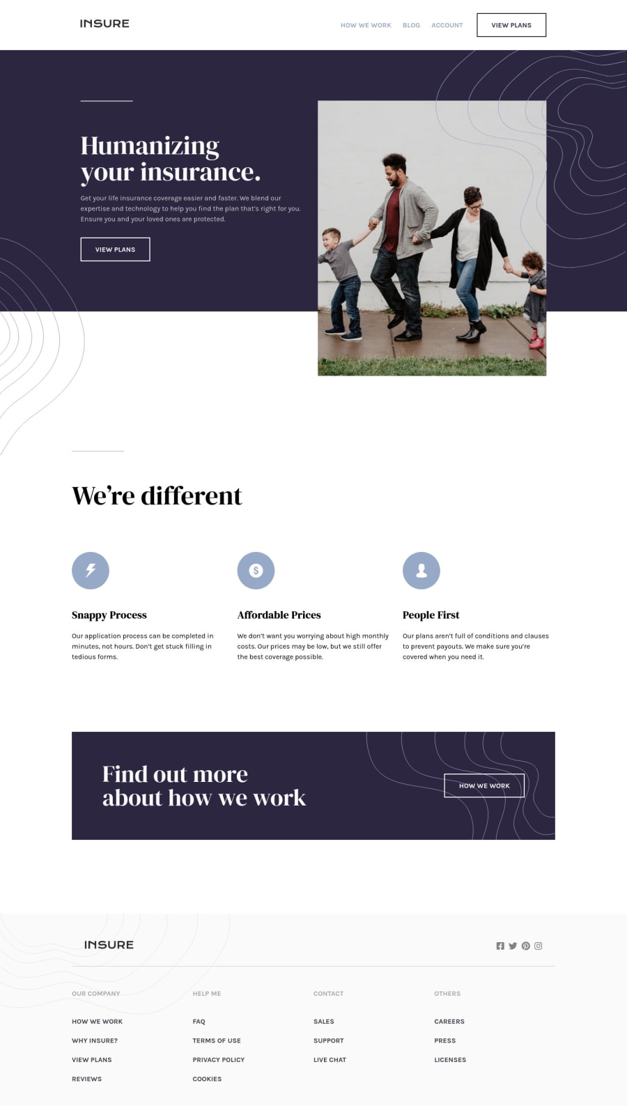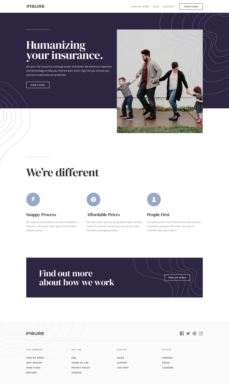
Design comparison
Solution retrospective
Feedback will be highly appreciated
Community feedback
- @FluffyKasPosted almost 3 years ago
Hey, that's a great solution! It looks very neat on all screen sizes.
There's a few bits you could perhaps improve on:
-
Insure logo alt-text (in header and footer sections): instead of "logo", "Insure" would be a better alt, I believe (more on this topic here).
-
Footer section, socials: this
divcould actually be aulwith links wrapped inli. Since these links lack a text description, you could use aria-labels! -
Perhaps the title of the footer link groups could be some sort of heading instead of
ptags. -
Your hero section doesn't belong in any landmark. It should go into either the
headerormain(probably putting it inmainis a better option). -
You're using multiple
h1headings. There should be only one for the main title of the page, then decrease the levels by one ^^ (great explanation on this topic here).
These are just minor things to be honest, overall I think you did awesome. I'll definitely look at your solution when I work on this challenge in the future ^^
Marked as helpful1 -
Please log in to post a comment
Log in with GitHubJoin our Discord community
Join thousands of Frontend Mentor community members taking the challenges, sharing resources, helping each other, and chatting about all things front-end!
Join our Discord
