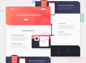
Design comparison
Solution retrospective
I can not figure out how add image to get same effect, so I use img as background
Community feedback
- @ChamuMutezvaPosted about 3 years ago
- site is not responsive - well the desktop presentation is looking good
- the immediate child of a
ulelement is anlielement. Other elements can only come in as children oflielement. The incomplete code below needs a revisit on the img
<ul class="header_nav"> <img src="./images/logo.svg" alt="" class="header_logo"> <li> <a href="#" class = "product"> Product <img src="./images/icon-arrow-light.svg" alt=""> </a>- heading elements must ascend in order without skipping levels - h1, h2, h3 etc. Use css to control font size.
Marked as helpful0@JimmyHoang296Posted about 3 years ago@ChamuMutezva thank you so much for your advice, I will try to fix it.
0 - @ConradMcGrifterPosted about 3 years ago
you can take a look at my solution. it's not perfect but I was able to achieve the image positioning with
position:absoluteMarked as helpful0@JimmyHoang296Posted about 3 years ago@ConradMcGrifter thank you so much for your helpful solution. You make your code so clean and easy to follow
0 - Account deleted
Hi,
Nice one on completing the challenge.
Desktop view looks ok, and I scaled down for the mobile view, and realized it's not there, I don't know why you didn't do it... I highly recommend you do it.
& in as little as 1300px, if not more, some of the text and the images start overlapping.
Keep coding👍.
Marked as helpful0@JimmyHoang296Posted about 3 years ago@thulanigamtee thank you so much for your comment. I try so hard to set 2 img in introduction section like an item but can not success. It makes me upset so I give up on mobile view :D
0
Please log in to post a comment
Log in with GitHubJoin our Discord community
Join thousands of Frontend Mentor community members taking the challenges, sharing resources, helping each other, and chatting about all things front-end!
Join our Discord
