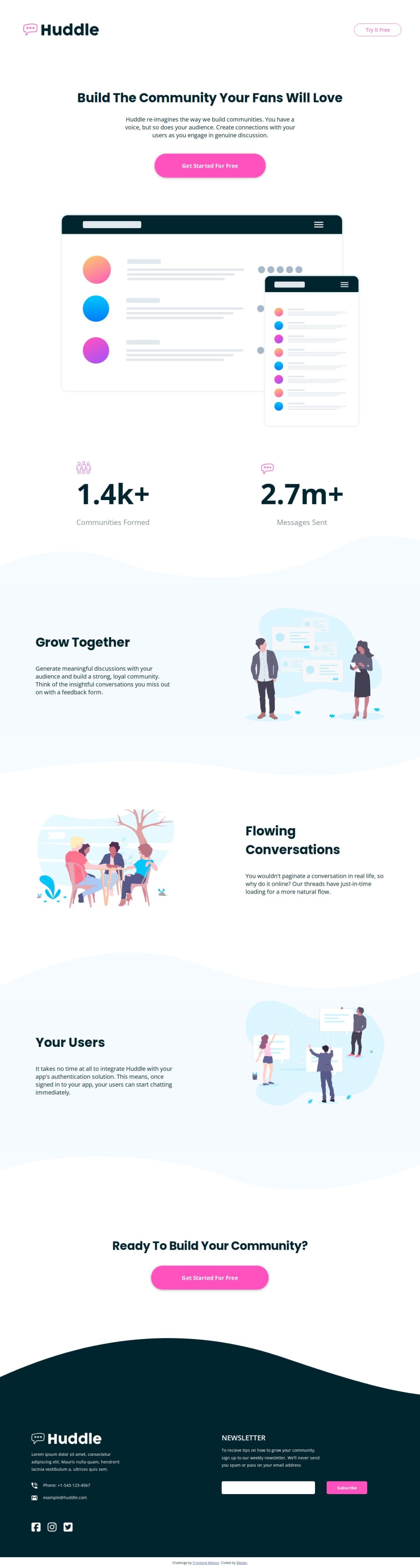


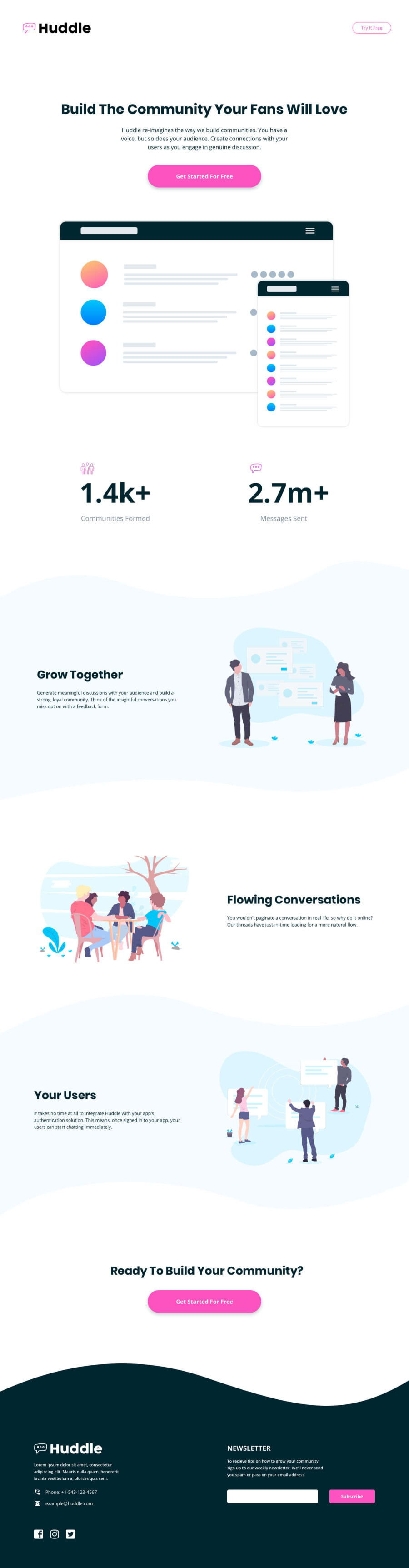
Design comparison
Solution retrospective
I'm satisfied of the media-responsive clamp tricks correctly applied throughout the page. I finally worked seriously with the design images and it allowed me to get the final design as close as possible to the reference.
What challenges did you encounter, and how did you overcome them?I had to think and experiment a bit about the sections' curves (I had to find the most reliable way of implementing them) and the error message without javascript (the problem was mostly in desktop layout as it went between the input and the button). To solve this last one I had to make additional declarations on the span responsible of rendering it, making the code even more convoluted than it already was before.
What specific areas of your project would you like help with?I would like to get advice for scss optimization, as I'm aware some parts are heavily redundant. Thanks.
Community feedback
Please log in to post a comment
Log in with GitHubJoin our Discord community
Join thousands of Frontend Mentor community members taking the challenges, sharing resources, helping each other, and chatting about all things front-end!
Join our Discord