Submitted about 5 years ago
SCSS HTML Vanilla JavaScript Insure Landing Page
@c-healey
Design comparison
SolutionDesign
Solution retrospective
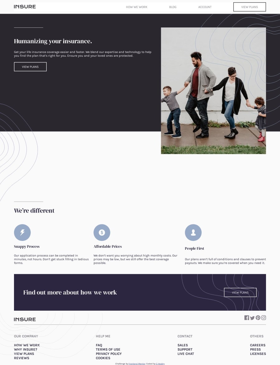
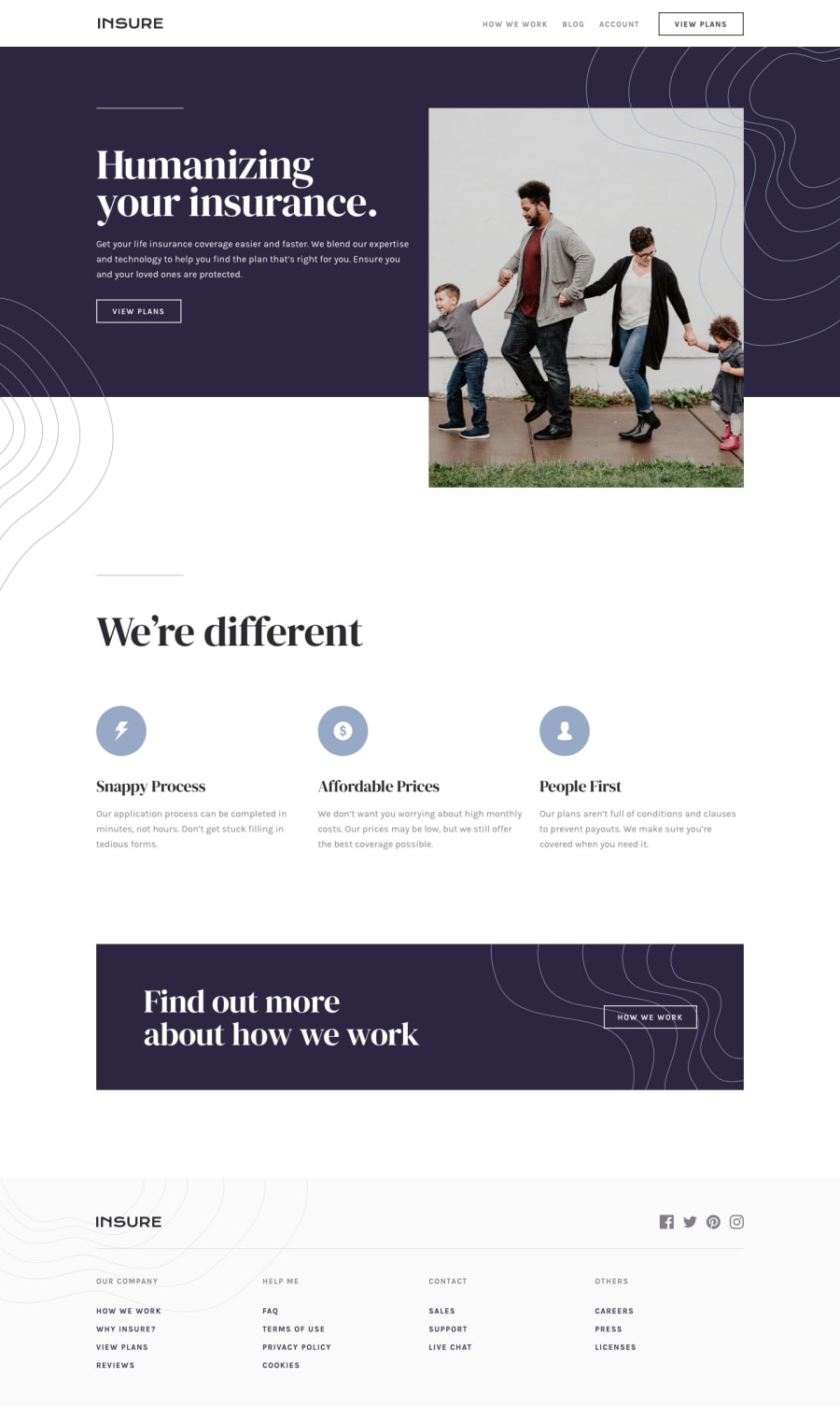
I found it very helpful to look at other solutions. I'm open to constructive criticism. The only things I'm not happy with in my implementation are the background image over the family photo is too big. I needed a lot of media queries to keep the top nav from breaking. Other solutions I looked at went to the mobile menu at a bigger screen width. Any suggestions on how to handle these two issues better?
Community feedback
Please log in to post a comment
Log in with GitHubJoin our Discord community
Join thousands of Frontend Mentor community members taking the challenges, sharing resources, helping each other, and chatting about all things front-end!
Join our Discord
