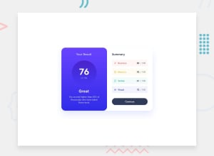
Design comparison
SolutionDesign
Solution retrospective
-
What did you find difficult while building the project? breakpoints, the correct use of BEM and semantics
-
Do you have any questions about best practices? What would be the correct way to name similar colors, where the only difference could be saturation or lightness?
Community feedback
- @jairovgPosted about 1 year ago
Hi Anderson, congrats on your solution; here are some comments that might help you to improve it:
Accessibility and semantics
- This is your heading map:
Frontend Mentor | Results summary component 2 Your Result 3 Great 2 Summary- All headings should have a hierarchy and a meaning. You can check this checklist provided by Deque University to learn some best practices related to headings that will help you improve your structure.
- All interactive elements, like anchors or buttons should provide different states to be universally accessible; those states should at least be
rest(default state),hover,focusandactive. Check for the requirements in the provided screenshots and try to not let the browser have thefocusone to provide a unique experience across devices. - You're creating two
sectionelements. There is an interesting blog post I like to share, named <article> vs. <section>: How To Choose The Right One which I invite you to read to check if they are the correct chosen elements. - Your solution has an
a11yissue injected by the lack of amainlandmark. You can read more about this issue on the Deque University Axe rules page. - This project has some opportunities to use techniques like
sr-onlyor someariaattributes to improve the experience of assistive technologies. I invite you to research about it and to improve your solution with it.
Styles
- Your solution is missing the shadow in the component container.
- The
buttonelement uses some browser native styles, including its focus status. As mentioned above, having a custom style following the style guides will provide a unique user experience across devices. - The component uses
pxas the unit for properties that must be dependent on the user preferences forfont-size. I suggest you useremoremdepending on the use case as the units.* The project has media queries that miss devices (like extra large). If you set your monitor to a resolution greater than1440pxyou'll notice the visual issue your project has. - You are using media queries to support a specific range of devices and miss some others. Try setting your device to
1441pxto see the issue.
I hope you find it useful. I'm happy to look at your solution if you make other changes.
0
Please log in to post a comment
Log in with GitHubJoin our Discord community
Join thousands of Frontend Mentor community members taking the challenges, sharing resources, helping each other, and chatting about all things front-end!
Join our Discord
