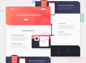
Design comparison
Solution retrospective
Any comments feedback and corrections will be appreciated.
Community feedback
- @pikapikamartPosted over 3 years ago
Hey, good work on this one. In terms of layout, both mobile and desktop is good.
A couple of concerns would be that;
-
When I click the navbar dropdowns and click another, the former dropdown's text is still visible like there is a delay on it. Refactoring those a bit will be awesome.
-
Font weights. I guess you use a semibold on the body text which makes them appear darker. Maybe it will be better if they are just set to regular like the original.
Only those 2 are my concerns. The navbar menu works pretty fine when I toggle in the mobile state.
Overall, you did a good job^^
0@jcoder6Posted over 3 years agoThank you for the Feedback. I'm Thanks for the problem you've mentioned. I really appreciated.
0 -
Please log in to post a comment
Log in with GitHubJoin our Discord community
Join thousands of Frontend Mentor community members taking the challenges, sharing resources, helping each other, and chatting about all things front-end!
Join our Discord
