


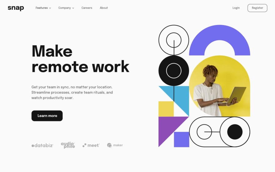
Design comparison
SolutionDesign
Solution retrospective
Any Feedback is Welcome, Thank You
Community feedback
- @abdraoufxPosted over 2 years ago
Hey Mate, Greate Job; But I Have an Advice For This Design To Make It Better:
- You Need To Add Some Space Between The Hero Picture And The Text.
- Add margin From The Bottom Side For The Button To Make Space Between it and the 4 images below it.
1@Dany-GitHubPosted over 2 years ago@abdraoufx i wonder why it looks so weird after i uploaded here , check README on GitHub repo it looked way better, anyway thanks for the suggestion
0@abdraoufxPosted over 2 years ago@Wa7dany I Think Because Of The Display Grid Try Change It To FlexBox In Your Developemment Envioremment And After Finish Trying You Can Check My Solution : https://www.frontendmentor.io/solutions/full-responsive-intro-section-with-dropdown-navigation-with-sass-and-js-rkMqqstN5
0

Please log in to post a comment
Log in with GitHubJoin our Discord community
Join thousands of Frontend Mentor community members taking the challenges, sharing resources, helping each other, and chatting about all things front-end!
Join our Discord