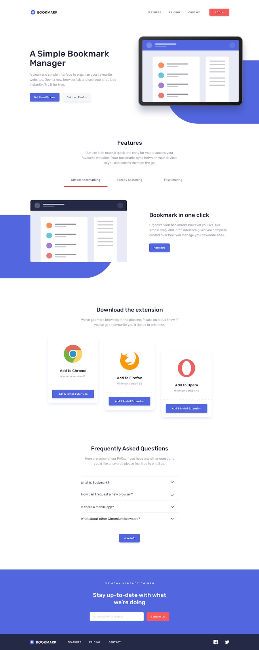
Design comparison
Solution retrospective
Any feedback is highly appreciated.
Community feedback
- @ApplePieGiraffePosted almost 4 years ago
Hi there, rafet! 👋
Always nice to see you complete another challenge! 😀 Good job on this one! 👏 I like the smooth transition of the accordion and the subtle change in height of the buttons when they are hovered over. 😉
I'd like to suggest,
- Allowing the background shapes and the background of the footer at the bottom of the page to grow with the width of the page in the desktop layout so that there isn't any empty space to the sides of those elements when the width of the page increases.
- Perhaps aligning the download cards in the tablet layout of the page (right after they change position from the desktop layout) so that they look a little more uniform.
Keep coding (and happy coding, too)! 😁
2@rafetbasturkPosted almost 4 years ago@ApplePieGiraffe
Hi! 👋
It is really nice to see your useful feedback as always! 😀 Thanks for your comment.
-
I changed the footer width as you suggested. (Changing background shapes would take some time, so I left them as they are 😀)
-
I changed the download cards' css code from
grid - autofittoflex - wrapto align center.
Happy coding!
1
Please log in to post a comment
Log in with GitHubJoin our Discord community
Join thousands of Frontend Mentor community members taking the challenges, sharing resources, helping each other, and chatting about all things front-end!
Join our Discord
