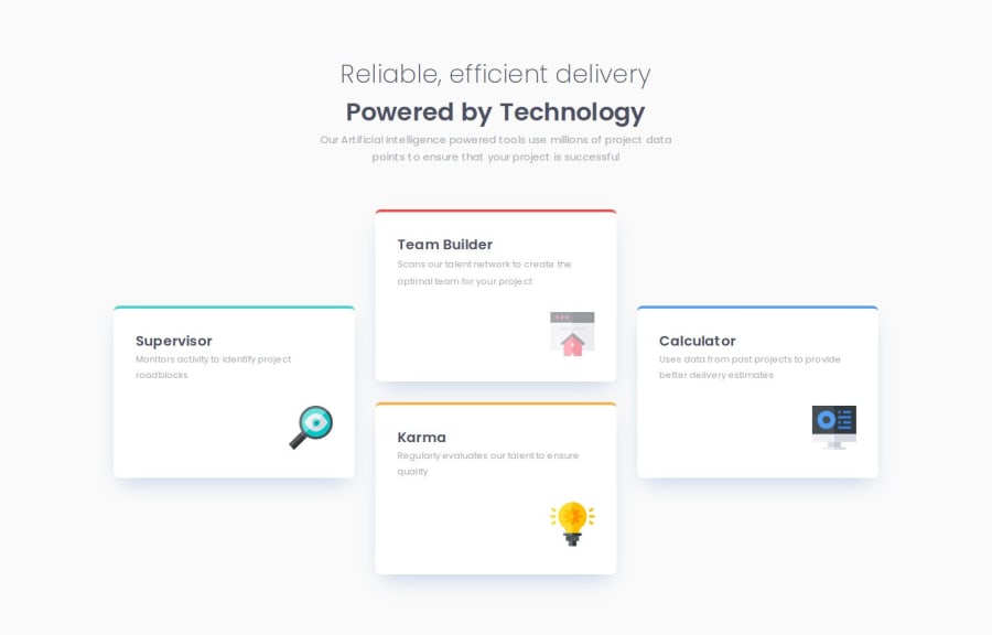
Design comparison
SolutionDesign
Community feedback
- @LesSylPosted about 2 months ago
Hi! your solution looks grate. I have a few suggestions:
- Your solution on small screens doesn't look very good. I would add a bit more space to the cards, for example by adding margins.
- Using rem or em units in @media queries is better than px because they are relative units that adapt to user settings, like their preferred font size. This makes your design more responsive and accessible, ensuring it looks good on different devices and respects user preferences.
- Try to use em and rem instead of px for example for padding and margin . You can read more about it here: Values_and_units
1
Please log in to post a comment
Log in with GitHubJoin our Discord community
Join thousands of Frontend Mentor community members taking the challenges, sharing resources, helping each other, and chatting about all things front-end!
Join our Discord
