Design comparison
Solution retrospective
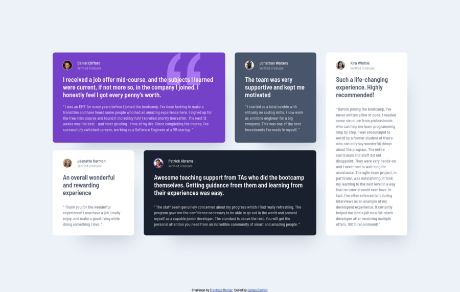
I decided to create a tablet layout as well, rearranging the grid for widths around 768px. I think it came out pretty good, but feedback is appreciated.
Community feedback
- @ApplePieGiraffePosted over 3 years ago
Hello, James English! π
Wowβgreat work on this challenge! π You've done a wonderful job in matching the design preview (just about pixel-perfect) and the intermediary layout that you added works really well! π Your code is looking good, too! π
Keep coding (and happy coding, too)! π
3@anglicusPosted over 3 years ago@ApplePieGiraffe Thanks so much for the kind words!
0 - @mattstuddertPosted over 3 years ago
Amazing work on this challenge, James! You've done an awesome job matching the design, and the additional layout switch you've created for tablet sizes looks great!
One small thing I'd recommend would be to change the
alt
attributes for the testimonial avatars, as they don't any extra context for screen reader users. At the moment, "user thumbnail" will be read for each testimonial, when the person's name and the fact they're a "verified graduate" is the key information. Changing toalt=""
will make screen readers skip those avatar images.Keep up the great work! π
2@anglicusPosted over 3 years ago@mattstuddert Thanks for the feedback and the tip about the alt attributes. Yeah, I need to learn more about proper accessibility standards and how screen readers work. I haven't dug too deeply into that yet.
0@mattstuddertPosted over 3 years ago@anglicus, you're welcome! Yeah, accessibility is one of those topics that's often missed but is crucial to being a professional front-end developer. Definitely worth digging into! π
0 - @tedikoPosted over 3 years ago
Hello, James! π
Congrats on finishing another challenge and also on getting featured in newsletter. I would suggest you to take a read about BEM modifiers,
.testimonial__grayish
.testimonial__white
etc, are your modifiers so you should name them like.testimonial--grayish
etc because those are flags on blocks or elements. Use them to change appearance, behavior or state. Also, read about Sass 7-1 pattern to keep your file management orginazed.Good luck with that, have fun coding! πͺ
1@anglicusPosted over 3 years ago@tediko Thanks for the very useful tips! I was in the newsletter? I just realized was not even subscribed to it (I had thought I would automatically be subscribed after joining, but apparently not). Do you know if there's a way to look at past newsletters?
1@tedikoPosted over 3 years ago@anglicus Latest newsletter. Click "Past Issues" in top left corner to see previous newsletters :)
0@anglicusPosted over 3 years ago@tediko Thanks! And I see one of your solutions made it in the newsletter, too. Congrats!
0 - @mathcrlnPosted over 3 years ago
Beautiful implementation and your code is also clean and organized, well done! ππΎ
1
Please log in to post a comment
Log in with GitHubJoin our Discord community
Join thousands of Frontend Mentor community members taking the challenges, sharing resources, helping each other, and chatting about all things front-end!
Join our Discord