
Design comparison

Solution retrospective
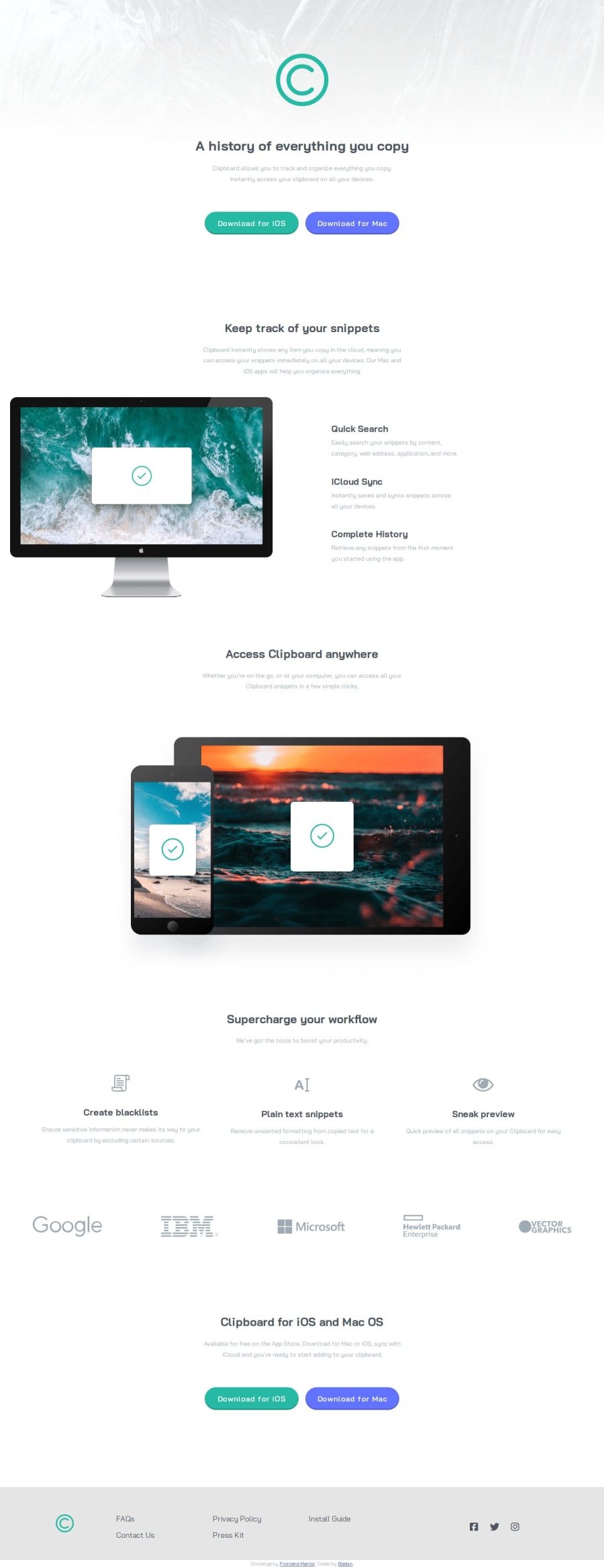
Since this was a challenge without necessary scripting I decided to reinforce my sass knowledge here. The results are mixed: although I like the final outcome and I remembered a lot of important functions in sass I think the styling code is not optimized enough.
What challenges did you encounter, and how did you overcome them?Some parts were very tricky due to particular alignments. A challenge I did not overcome was coloring local icons and I resorted to outsourced icons (if you look carefully the facebook icon isn't the one provided with the starter files). If anyone has some advices on how to do it those would be really appreciated, thanks!
What specific areas of your project would you like help with?I would like to get some sass optimizing advices and some guides to color icons. Thank you!
Community feedback
Please log in to post a comment
Log in with GitHubJoin our Discord community
Join thousands of Frontend Mentor community members taking the challenges, sharing resources, helping each other, and chatting about all things front-end!
Join our Discord