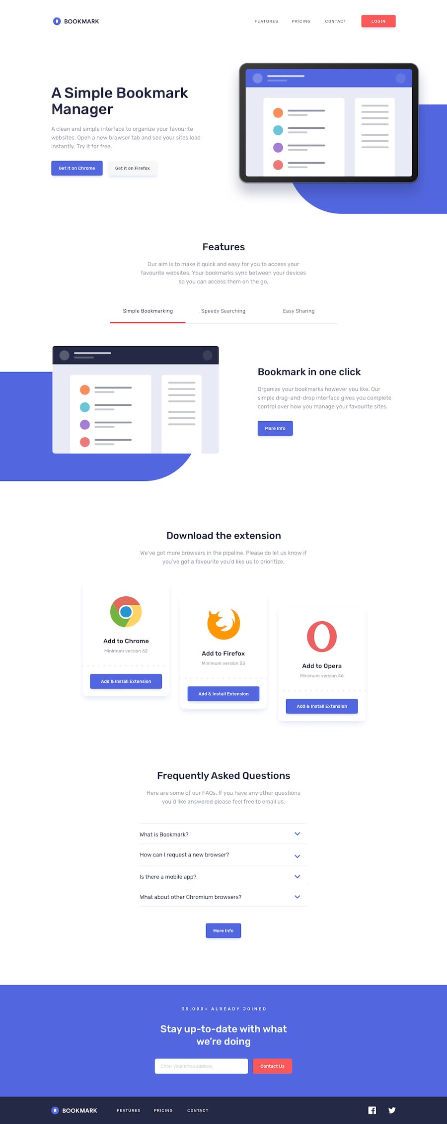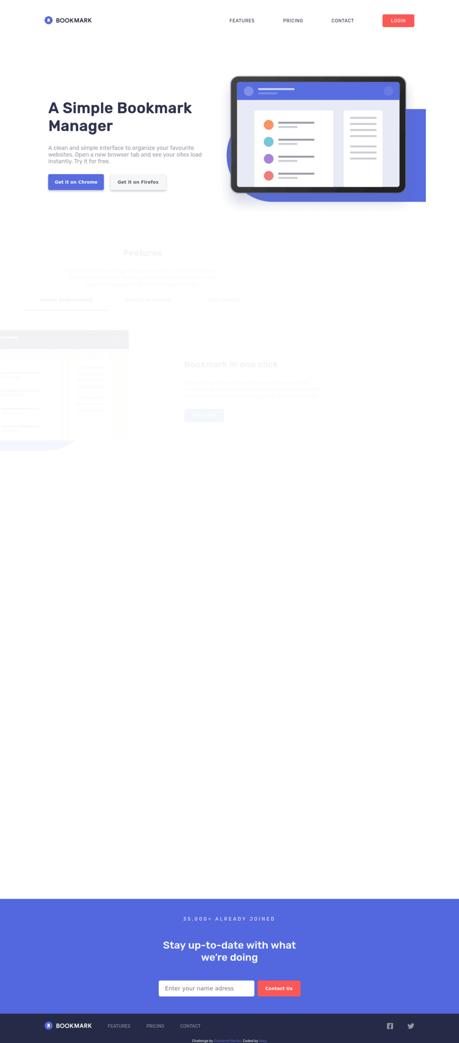
Design comparison
Solution retrospective
Hi everyone, this challenge allowed me to try new things, I added animations that were not required but I learned scroll animations, and lots of things that I had not put into practice, it was fun to do! all feedback is greatly appreciated! : D
Community feedback
- @ApplePieGiraffePosted over 3 years ago
Hi, Alex! π
Nice work on this challenge! π I like how you made the navigation for this challenge sticky! π The transition of the mobile menu is nice, too! π
One or two things I suggest are,
- Adding some space between the titles of the feature tabs and the images above them in the desktop layout.
- Increasing the font-size of the text in the FAQ accordion near the bottom of the page.
Keep coding (and happy coding, too)! π
2 - @RocTanweerPosted over 3 years ago
Aside from responsiveness, your work is amazing!
I am afraid, but your site is broken on my phone... Hope it helps π€
1@ByKyZoPosted over 3 years ago@RocTanweer Thanks for your feedback RocTanweer :) it's true I noticed it just after posting I'll fix it! thank you for confirming it to me;)
0
Please log in to post a comment
Log in with GitHubJoin our Discord community
Join thousands of Frontend Mentor community members taking the challenges, sharing resources, helping each other, and chatting about all things front-end!
Join our Discord