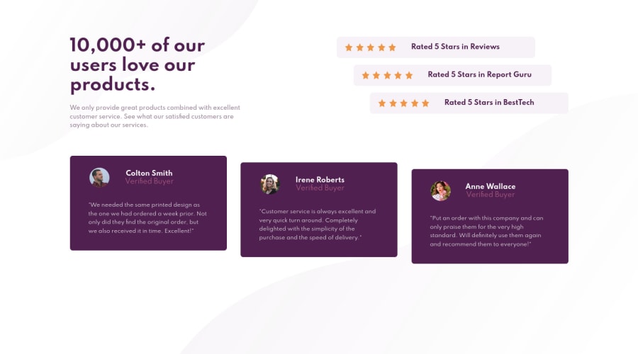
Design comparison
Solution retrospective
Hello, I want to note that having these challenges helps be more comfortable with coding. You can learn the theory and syntax but it helps to actually build something. It can be hard to think of a project to practice on and having these pre built challenges makes it easier to practice. Anyway, as usual rate how well I achieved the mockup on a scale from 1 - 10. I used sass/scss preprocessor for styling. Used nesting, used scss variables instead of css variables, and mixins...Pretty basic. Am I using BEM Naming conventions correctly? Are my class names meaningful and help you read the code easier? Is the code clean or at least acceptable? Is the structure for HTML or CSS clear? If something is not clear, where should I put comments?
Again , Thank you in advance to anyone taking the time to look at my code. Your feedback is greatly appreciated.
Community feedback
Please log in to post a comment
Log in with GitHubJoin our Discord community
Join thousands of Frontend Mentor community members taking the challenges, sharing resources, helping each other, and chatting about all things front-end!
Join our Discord
