Design comparison
Solution retrospective
Any feedback is highly appreciated!
Community feedback
- @ApplePieGiraffePosted over 3 years ago
Hi, rafet! 👋
I just noticed this is your 31st Frontend Mentor challenge! 😀 That's quite a few you've done! 👏
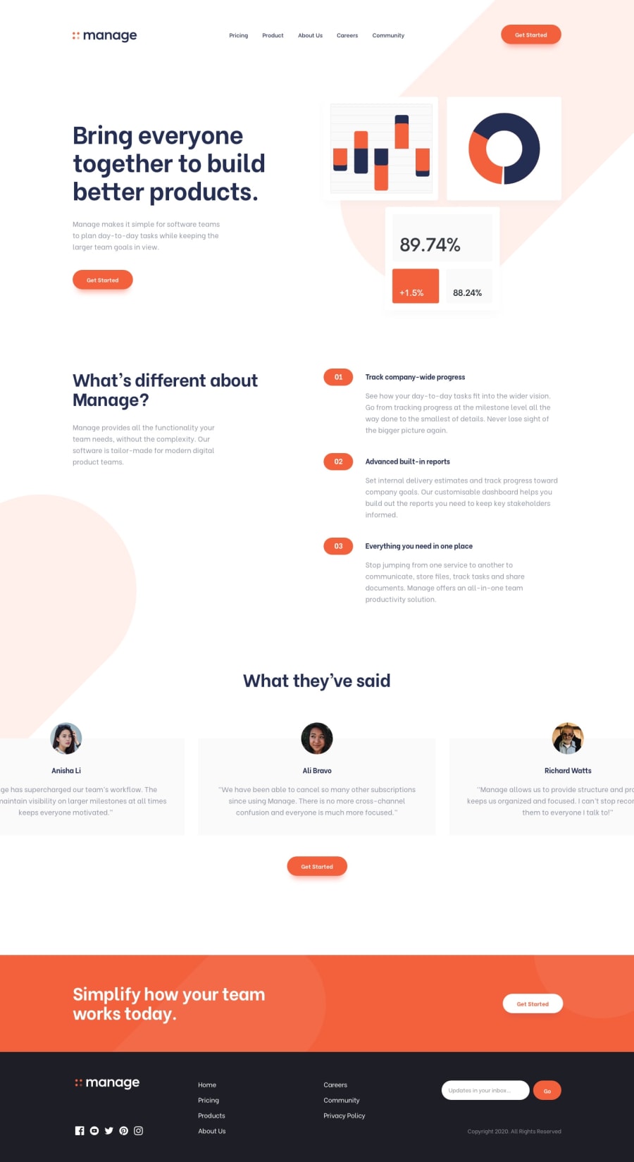
The design preview for your solution looks great, but for some reason, I think the styles for the page aren't loading when I click on the live preview or something, so while the content of the page is there, most of it looks a bit out of place and, well, not very styled. 🧐 You might want to look into that to see what's going on! 😉
But keep coding (and happy coding, too)! 😁
0@rafetbasturkPosted over 3 years ago@ApplePieGiraffe
Hi! 👋
I've just changed background-images and uploaded wrong stylesheet. 😁 Thanks for warning.
Actually I want to learn about what should be done for the carousel/slider on large screens? Is it okay this way?
Happy coding!
1@ApplePieGiraffePosted over 3 years ago@rafetbasturk
The styles seem to be loading and everything looks much better, now! 😀
I haven't actually completed this challenge yet, so I haven't given very much thought about what to for that carousel, but what you have so far seems okay to me. 🙂
Maybe one thing that would make it a little cooler would be if the ends of the testimonial cards to the sides of the center card weren't suddenly cut off (not all of each card can be seen). I think it's fine to have the cards slide out from behind some white space but it would look better if the entire card can be seen on large screens. 😉
Otherwise, nice job, as usual! 👍
Keep completing challenges and learning new things! 🙌
1
Please log in to post a comment
Log in with GitHubJoin our Discord community
Join thousands of Frontend Mentor community members taking the challenges, sharing resources, helping each other, and chatting about all things front-end!
Join our Discord

