Design comparison
Solution retrospective
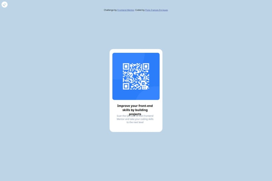
centering the div, right position of image and the text
What challenges did you encounter, and how did you overcome them?positioning of the dv, image and text
What specific areas of your project would you like help with?Project with logical background like a color sequence it has logics behind it
Community feedback
- @LonlysoftPosted 2 months ago
Alright, here's some tips:
-
I see that you tried the position absolute centering in the container. This can't be done there because the body has no height or width. (50% of 0 is 0). To that work define a width for the body element to actually use position absolute centering. Yet, I don't recommend absolute centering unless you're making elements that need to be overlapped. This is not the case so I recommend flexbox.
-
The image has its original size. So it comes off the boundaries of the container. I see that you tried to make the qr-code div as a try to contain image size, but issue is that the image doesn't obey this declaration. My recommendation is to add the img selector in CSS and set its width and height to 100% or... just delete the qr-code div and set the class name qr-code directly to the img tag.
About logic background color: In this project there's no need for a said "it has logics behind it". The little "gradient" there is just made using CSS' box-shadow property in the container. And the background color is just a solid color that you can get 1:1 on the style-guide.md file provided in the challenge. It's in hsl() between lines 14 to 18.
I hope those tips help.
Marked as helpful0 -
Please log in to post a comment
Log in with GitHubJoin our Discord community
Join thousands of Frontend Mentor community members taking the challenges, sharing resources, helping each other, and chatting about all things front-end!
Join our Discord
