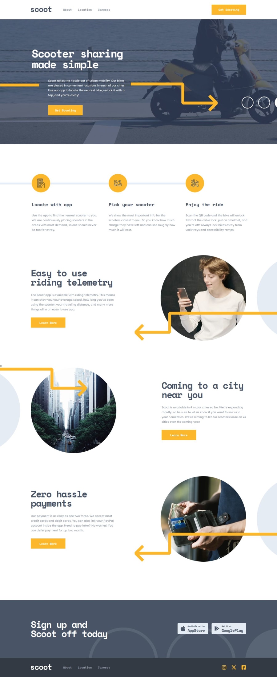
Design comparison
Solution retrospective
Hi everybody! Mainly choose this challenge because of the multi-page aspect. Got some more experience in with React Router DOM. The design is very light on interactivity/state management, but very heavy on styling and creating my components as re-usable as possible was a very nice challenge. I recommend this challenge to anyone as a great portfolio asset.
Noted: accessibility tools do not pass certain color contrasts and the sequence of headings in this design according to WCAG 2 AA rating. Design should be updated by Frontend Mentor...
As always; if you have any remarks or comments please do so :)
Community feedback
Please log in to post a comment
Log in with GitHubJoin our Discord community
Join thousands of Frontend Mentor community members taking the challenges, sharing resources, helping each other, and chatting about all things front-end!
Join our Discord
