Design comparison
SolutionDesign
Community feedback
- @ClonephazePosted 11 months ago
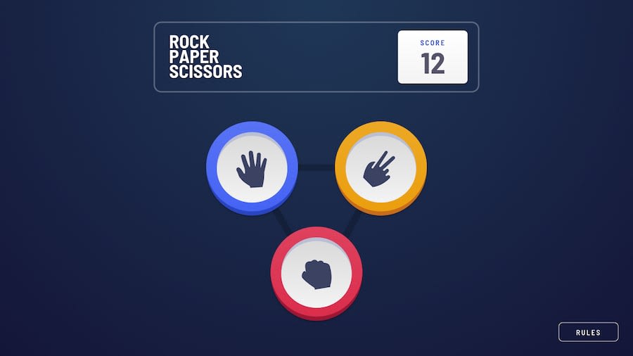
Looks good! One thing though, for the pieces/tokens you're using divs. When you're creating something that you intend to be clicked, it should almost always be a button element instead. "<button type="button" aria-label="Paper" class="token-paper"></button>" for instance. You'll just need to style out the default border that buttons come with in your css.
The reason is that while both can be clicked and you get a result, button elements can also be tabbed to by default and "clicked" with the enter key which is more accessible.
Marked as helpful0@ale02codePosted 11 months ago@Clonephaze You are very right, thank you very much
0
Please log in to post a comment
Log in with GitHubJoin our Discord community
Join thousands of Frontend Mentor community members taking the challenges, sharing resources, helping each other, and chatting about all things front-end!
Join our Discord
