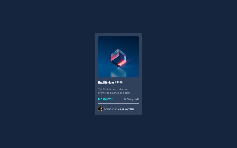
Design comparison
Community feedback
- @DebabrataBanikPosted 4 months ago
Your design looks great! I have a few suggestions that could further improve it:
-
Remove padding from the body if you're centering the card using Flexbox it’s not necessary in that case. If you still want to add spacing, consider using padding-inline to prevent the card from touching the viewport edges.
-
Avoid using fixed height values for components unless absolutely necessary. Allow the content inside to adjust dynamically for better responsiveness.
-
In your header where you’ve used an image container you can use
display: flexto make the image take up the entire available space within its container. -
Lastly, it looks like you might have missed adding hover or active state effects.
Marked as helpful0 -
Please log in to post a comment
Log in with GitHubJoin our Discord community
Join thousands of Frontend Mentor community members taking the challenges, sharing resources, helping each other, and chatting about all things front-end!
Join our Discord
