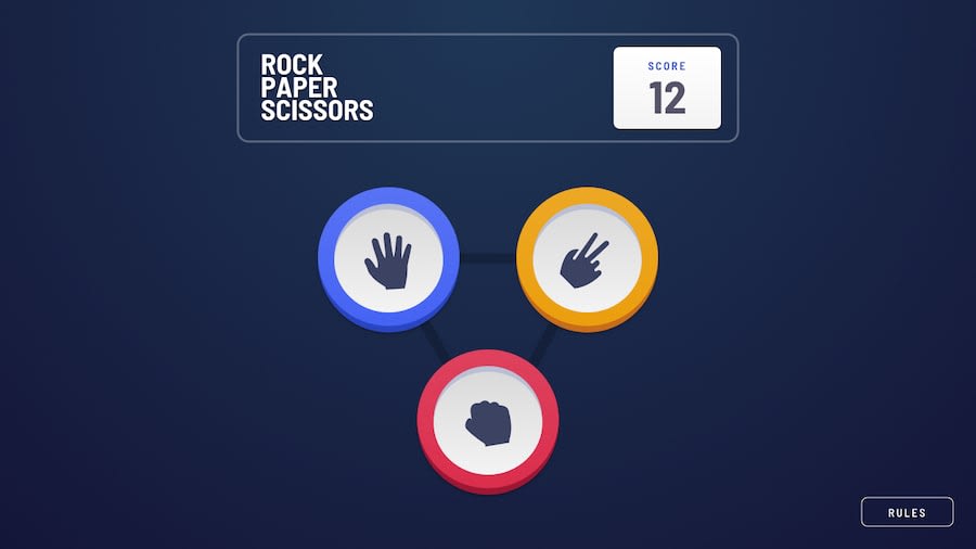
Design comparison
Solution retrospective
resolutions are 1300-1500px & 375px;
if u have any advice, please tell me to fix it and improve my skills
Community feedback
- @webguy83Posted over 2 years ago
Your fonts and layout really breaks a lot as soon as you scale it. Try to follow the mockups as close as you can. I noticed you were using <br /> tags a lot in your code as well. Best to avoid as well. Good luck!
Marked as helpful1 - @wanlucasPosted over 2 years ago
hello, @Lomsk1! I have a few things to mention that could be tweaked.
when your project is opened in the mobile version, the buttons are totally disorganized. Responsive in general is not working very well.
the console is showing some numbers, I believe they came from some test you did.
there are some accessibility issues that could easily be fixed.
everything else is fine, congrats.
Marked as helpful0@Lomsk1Posted over 2 years ago@wanlucas Thank You!
Firs of all, I made it only 1300-1500px & 375px. I can fixed it .
I forgot to remove some conslole.log function in JS, so the numbers come from.
0
Please log in to post a comment
Log in with GitHubJoin our Discord community
Join thousands of Frontend Mentor community members taking the challenges, sharing resources, helping each other, and chatting about all things front-end!
Join our Discord
