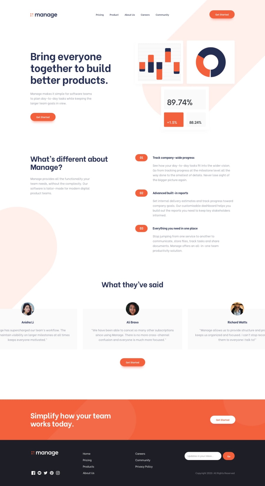
Design comparison
Solution retrospective
This challenge took me longer than I expected with little tweaks it has in design and slide functionality for different screen sizes. Nevertheless had fun building it :) Looks like font-family used in design is no longer supported and changed to another version so font may be a little off.
Community feedback
- @MahdiSohailyPosted over 2 years ago
WOW, really accurate. How do you manage it?
0@ErayBarslanPosted over 2 years ago@MahdiSohaily thanks :) I design each part separate starting from top and move to bottom when I'm happy with result. For example I'd design navigation to what I think would be close to the provided. From there I take the detailed approach. I compare my design to provided by taking screenshots on responsive design mode with the same resolution. At first It's been taking more tries but as for everything goes, practice makes it natural.
1@MahdiSohailyPosted over 2 years ago@ErayBarslan How do you adjust the resolution of your design with solution?
0@ErayBarslanPosted over 2 years ago@MahdiSohaily You can view the web page in responsive mode by right-click > inspect > responsive design mode. Depending on your browser it's either on bottom-left or bottom-right. Then you can change the resolution of the page in view mode.
1
Please log in to post a comment
Log in with GitHubJoin our Discord community
Join thousands of Frontend Mentor community members taking the challenges, sharing resources, helping each other, and chatting about all things front-end!
Join our Discord
