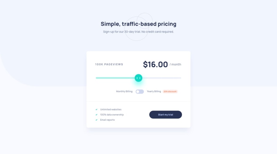
Design comparison
SolutionDesign
Solution retrospective
Based on previous suggestions here I am hoping I am using elements correctly.
Community feedback
- @AdrianoEscarabotePosted about 2 years ago
Hi ArthurS, how are you?
I really liked the result of your project, but I have some tips that I think you will enjoy:
- images must have alt text unless it is a decorative image, for any decorative image each IMG tag must have empty
alt=""and addaria-hidden="true"attributes to make all the assistive technologies of the Web , the screen readers. Learn the differences between decorative/meaningless images vs important content.
to improve the design of your page, we can do this:
body {
    background-size: 100% 50vmin;
}
It will prevent the content from breaking and occupying the entire screen!
The rest is great!
I hope it helps... 👍
Marked as helpful0 - images must have alt text unless it is a decorative image, for any decorative image each IMG tag must have empty
Please log in to post a comment
Log in with GitHubJoin our Discord community
Join thousands of Frontend Mentor community members taking the challenges, sharing resources, helping each other, and chatting about all things front-end!
Join our Discord
