Design comparison
SolutionDesign
Solution retrospective
Please evaluate
Community feedback
- @elidakirigoPosted almost 3 years ago
hello there EXCUUSEMOI! I think you've done a pretty great job there. (thumbs up)
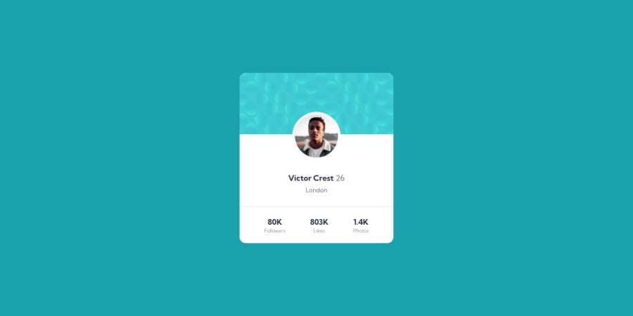
I have noted the top and bottom light blue images are missing from your part of the image, I would suggest using before or after tag attributes to get them placed on the body of your code, using background color and background image may be of help too.
thanks, happy coding :)
0
Please log in to post a comment
Log in with GitHubJoin our Discord community
Join thousands of Frontend Mentor community members taking the challenges, sharing resources, helping each other, and chatting about all things front-end!
Join our Discord
