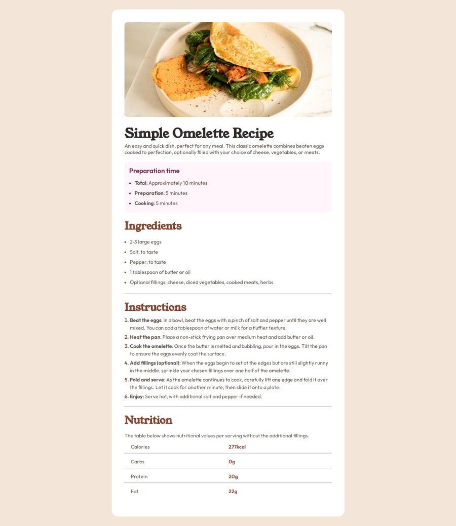
Design comparison
Solution retrospective
I had a lot of fun doing this challenge, I put my Sass skills into practice. Any suggestion would be appreciated.
Community feedback
- @juliengDevPosted 5 months ago
Hello there! 👋 I've had the pleasure of reviewing your project, and I'm impressed with your efforts! Your implementation shows great promise. I'd like to share some observations that might help enhance your work even further.
Key Strengths: The design is very close to the requested layout, showing great attention to detail. Effective use of CSS variables for fonts, demonstrating good practices for maintainability. Responsive design implementation, with a media query for smaller screens, showing consideration for different device sizes.
Areas for Growth:
-
Accessibility: • Consider enriching your HTML with more semantic elements like
<header>
,<footer>
, and<article>
. • Enhance accessibility by adding ARIA labels where appropriate, especially for complex elements like the nutrition table. -
Responsive Design: • Try incorporating more relative units (rem, em, %) for improved flexibility across devices. • Explore robust layout systems like CSS Grid or Flexbox for more dynamic responsiveness.
-
CSS Organization: • Look into CSS methodologies like BEM or SMACSS for better structure and maintainability. • Group related styles and use comments to clearly separate different sections.
-
Performance and Optimization:
• Leverage CSS custom properties (variables) for frequently used values like colors.
-
Typography and Aesthetics: • Implement a comprehensive typography scale for improved visual hierarchy. • Use unitless values for
line-height
to enhance responsiveness. • Consider adding more whitespace between sections for improved readability. -
Code Quality and Compatibility: • Tidy up by removing unused styles and ensuring consistent formatting. • Enhance browser compatibility with vendor prefixes or tools like Autoprefixer.
-
Functionality and SEO: • Consider adding interactive elements like a print button or serving size adjuster. • Boost SEO by including relevant meta tags in the
<head>
.
Remember, these are suggestions to help you grow. You're doing great work, and each project is a step forward in your development journey. Keep pushing yourself and exploring new techniques!
I hope you find my feedback valuable. If it was helpful, I'd really appreciate if you could mark my comment as helpful on the platform. Your feedback helps me improve too! 🌟
Happy coding, and I'm looking forward to seeing your future projects! 💻✨
0 -
Please log in to post a comment
Log in with GitHubJoin our Discord community
Join thousands of Frontend Mentor community members taking the challenges, sharing resources, helping each other, and chatting about all things front-end!
Join our Discord