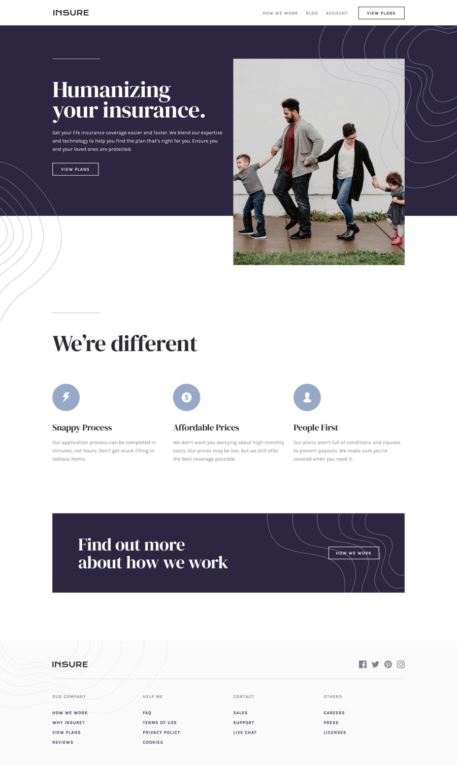
Design comparison
Solution retrospective
I had a lot of fun working on this one, played around with the clamp property.
Laying out the background images was a bit trouble some. Is there a better way to position the background images without using pseudo elements?
Comments and corrections are welcome.
Community feedback
- @muhammadshajjarPosted about 3 years ago
Hi kevin, Welldone you did a great job, it response well.
I have some suggestions for you
- the
atag that wraps theimgshould havearia-label="home- insure". This way, users will know where this link would take them. this has to be applied to both theheaderandfooterlogos. I think the word insure is more likely foralt, rather than logo - The how we work should be a link, in my opinion, using
atag and not abutton. Use thebuttonif it will act as a control for something. But on this, it is treated as a link, go foratag. - Your logo image should not be in
nav. - For any decorative images, like in this case the icons in your
cards, you should leave thealt=""and addaria-hidden=" true"orrole=" presentation"to make sure that all screen readers will ignore those icons.
Marked as helpful1@imonaarPosted about 3 years ago@muhammadshajjar Thank you. I have implemented all your suggestions. On the logo image not being in the nav, implementing from my next projects
0 - the
- Account deleted
Hi,
I honestly think at 1440px it looks, but there's problems as your switch to smaller screen sizes;
-
The photo at the top and the text on the side of it overlaps as the screen size decreases, and this goes on until you reach the mobile view. Not sure what you used but with
flex-boxit surely wouldn't be happening. -
The whole page loses padding so everything is just on the edges when you down-size.
-
Mobile view looks ok, and give the mobile menu should cover the whole screen, so that also needs fixing 'cause it's currently not.
Keep coding👍.
Marked as helpful0@imonaarPosted about 3 years ago@thulanigamtee @arshad81 thank you for your feedbacks. I find that progressively resizing towards mobile view is what makes it look awful. probably because is positioned that hero image absolutely in desktop view, working on making itbetter
0 -
- @arshad81Posted about 3 years ago
Hey Kevin, you did a great work but you messed up the Side Nav Bar for smaller screens. That's the only thing you did wrong. Amazing work keep it up
Marked as helpful0
Please log in to post a comment
Log in with GitHubJoin our Discord community
Join thousands of Frontend Mentor community members taking the challenges, sharing resources, helping each other, and chatting about all things front-end!
Join our Discord
