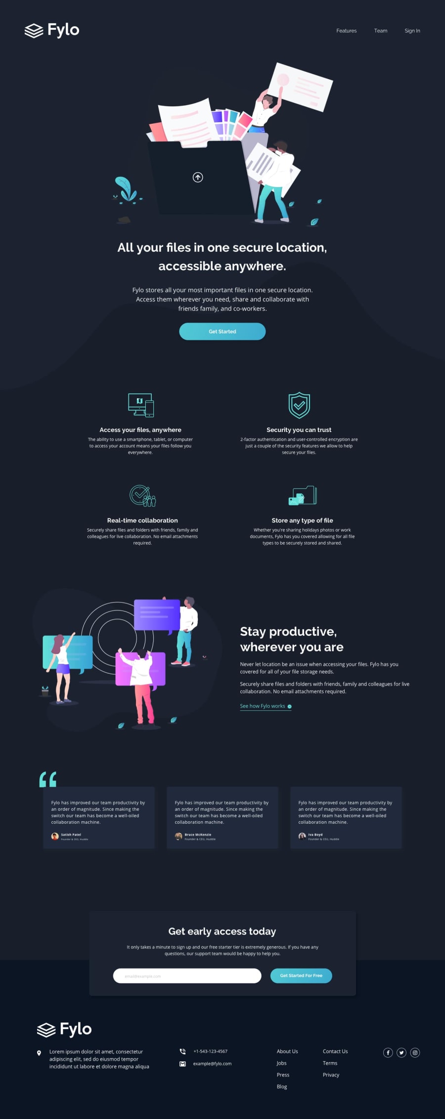
Design comparison
Solution retrospective
I found this one quite fiddly, one of my main issues is positioning the the blob on the banner, I always have a hard time getting these to be responsive. I'm not sure if I'm using the best approach for them any tips would be great, and any other feedback will be greatly appreciated, thank you.
Community feedback
- @pikapikamartPosted over 3 years ago
Hey, great work on this one. To be honest, I find it quite hard as well to position that blob thing that you are talking about. But still, your layout is fine but I had to zoom out because on the 4 feature sections, I am not getting the desktop layout. Are you working on a large screen or are you zoomed out when you created this one? The mobile layout seems fine as well.
Some suggestions would be:
- This one is just list of tweakings 1.1.
0@chrisbailey85Posted over 3 years ago@pikamart I am using a large screen, which I have found makes it a little bit difficult at times as it's a lot bigger than a normal monitor.
0@pikapikamartPosted over 3 years ago@chrisbailey85 Wait, my comment is not complete eh. I though I submitted it earlier completed. So sorry for that incomplete feedback.
-
Tweaking of the font-sizes will be a really awesome in here. Since some text are too small to read, example are those in the testimonial section.
-
The sizes of the social media icons needs to be adjusted well
-
The
.productive__textselector needs to be centered in the mobile state. As of now, other sections are aligned at the center in the mobile state, but theproductive__textare on the left. Making consistent layout is really good.
Just those tweaking on the content will be really awesome. Sorry for the incomplete comment before :>
1
Please log in to post a comment
Log in with GitHubJoin our Discord community
Join thousands of Frontend Mentor community members taking the challenges, sharing resources, helping each other, and chatting about all things front-end!
Join our Discord
