


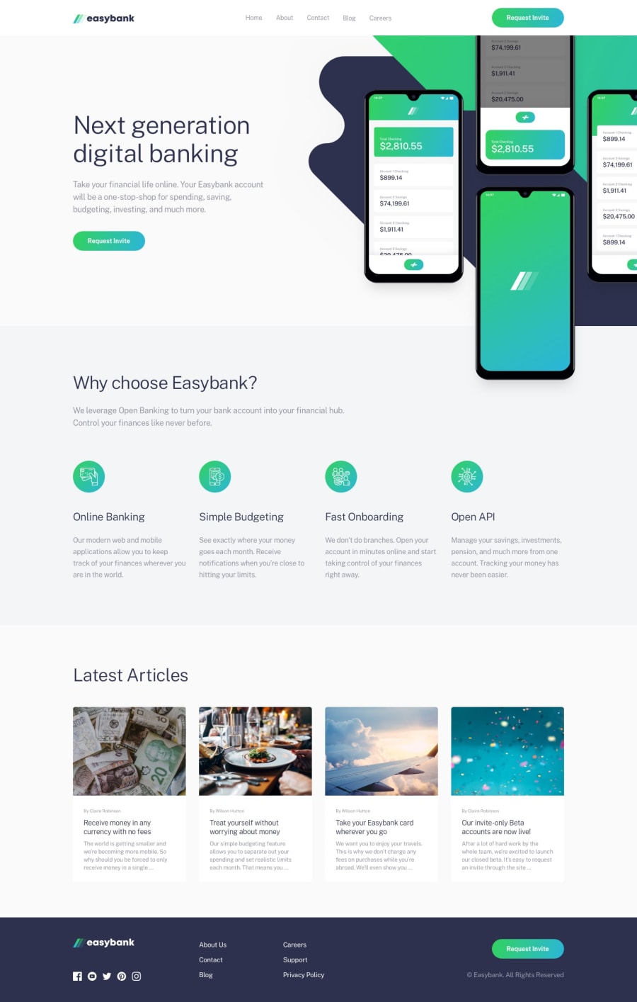
Design comparison
SolutionDesign
Solution retrospective
Any feedback is welcome :3
Community feedback
- @ovidiuantonioPosted over 4 years ago
Hello Pierre,
Nice solution so far! The site looks very good and is quite responsive. To make it better try to find better places to put the breakpoints for the mobile version. I saw that you added one nearly 770px but for the intro section is kinda too late, the image occupies almost the entire screen and for the text is left very little space.
These are the media queries I use in every solution:
- 0-600px (mobile)
- 600-900px (tab port)
- 900-1200px (tab land)
- 1200px (large screens)
And also don't forget to add the hover states for the "Request invite" buttons.
Happy coding! Keep going!
0

Please log in to post a comment
Log in with GitHub
Join our Discord community
Join thousands of Frontend Mentor community members taking the challenges, sharing resources, helping each other, and chatting about all things front-end!
Join our Discord