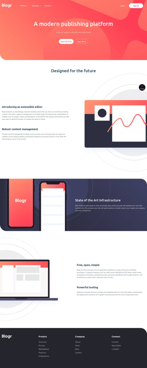
@christopher-adolphe
Posted
Hi Deniel!
The markup, the styles and the JavaScript are clean and well organised. π
I noticed some minor things you could improve:
- There is a small horizontal movement on the links of the main navigation as you hover over them. It is being caused by your
_font.sass
partial which is applying a generic rule offont-weight: 700;
on all anchors. Maybe you should override this rule in your_header.sass
partial. - It would be nice to dismiss the main navigation dropdown whenever the user is clicking elsewhere.
- Same for the mobile main navigation, if any of the dropdown was activated, it would be nice to dismiss it whenever the user toggles the navigation to close.
I am also curious to know what is the use case of having: π€
<img src="./img/illustration-laptop-mobile.svg" alt="Laptop powerful tooling">
vs
<picture>
<source media="(min-width: 55em)" srcset="./img/illustration-laptop-desktop.svg">
<img src="./img/illustration-laptop-mobile.svg" alt="Laptop powerful tooling">
</picture>
You did a great job for this challenge. Keep it up! π
Marked as helpful
@denielden
Posted
@christopher-adolphe Thank you so much for the feedback and great comments!
I totally agree on ignoring the drop-down menus as you say and I wanted to do it but I'm running out of ideas on the logic to write to do it, do you have any advice? I was thinking of putting a listen event on the entire DOM but I find it quite over the top and punchy for performance as well.
I use img
when putting an image without special needs, while I use picture
if I need more features such as in this case changing the image when a certain resolution is reached. By doing so I write a clean and essential code.
Happy coding!
@christopher-adolphe
Posted
Hi @denielden.
This picture
technique looks very interesting, I will give it a try.
Adding an event listener to the entire body
would definitely be costly. I've checkout your solution's git repo and tried the following which seem to do the job of dismissing the dropdown.
- Added an
id
to theul
element:
<nav id="navbar" data-visible="false">
<ul id="menu"></ul>
</nav>
- Refactored the JavaScript logic for the
navbar
:
const navToggle = document.querySelector('.mobile-nav-toggle'),
nav = document.querySelector('#navbar'),
menu = document.querySelector('#menu');
const openSubmenu = (event) => {
const { target } = event;
const parentMenu = target.parentNode;
if (parentMenu.classList.contains('open')) {
parentMenu.classList.remove('open');
return;
}
const activeParentMenu = document.querySelector('li.has-submenu.open');
if (activeParentMenu) {
activeParentMenu.classList.remove('open');
}
parentMenu.classList.add('open');
};
const dismissSubMenu = () => {
const viewportWidth = window.innerWidth;
const activeParentMenu = document.querySelector('li.has-submenu.open');
if (activeParentMenu && viewportWidth > 879) {
activeParentMenu.classList.remove('open');
}
};
navToggle.addEventListener('click', () => {
const visible = nav.getAttribute('data-visible');
if (visible === 'false') {
nav.setAttribute('data-visible', true);
navToggle.setAttribute('aria-expanded', true);
} else {
nav.setAttribute('data-visible', false);
navToggle.setAttribute('aria-expanded', false);
const activeParentMenu = document.querySelector('li.has-submenu.open');
if (activeParentMenu) {
activeParentMenu.classList.remove('open');
}
}
});
menu.addEventListener('click', openSubmenu);
menu.addEventListener('focusout', dismissSubMenu);
Instead of adding a click event listener to each li
, you can leverage on the event delegation technique and extract the logic to the #menu
element.
While I was checking when the mobile navigation kicks in, I noticed that on a viewport width of 880px
, the navigation is getting a kind of in-between style of mobile and desktop.
Marked as helpful
@denielden
Posted
@christopher-adolphe Wow! Great solution and refactoring, I have already made the change :) This feature had bothered me for some time and I couldn't find a solution.
I used an 880px viewport because I prefer to create as few breakpoints as possible and only when the design breaks.
Thanks again! And happy coding :)
@christopher-adolphe
Posted
Hi @denielden,
I'm happy to help and glad that those feedback were helpful π€π€
I use the same approach regarding breakpoints; the fewer, the better π Nowadays, there are so many devices, we just can't add breakpoints for each of them.
Best regards