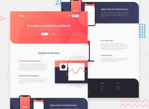
Design comparison
Solution retrospective
This project has made me realize I need to go and do a bit more studying on making navbars. I'm fine with making a mobile nav. it's converting it into a desktop version I'm having issues with.
I also had a problem positioning the mobile phone's image. I set the section to overflow hidden, to stop the circles coming outside the section. I then couldn't bring the picture of the mobile phones on top of it. In the end, I set it to an after pseudo-element on the section before and pushed it down.
I also time in myself this time it took me 8 hours and 29 minutes.
Any feedback would be appreciated thank you.
Community feedback
- @chrisbailey85Posted over 3 years ago
I'm not sure why the mobile phones are positioned like that in the screenshot. I've tried to find the screen size that it does that on using the Google Chrome developer tools, but it never lines up like that which is weird.
0
Please log in to post a comment
Log in with GitHubJoin our Discord community
Join thousands of Frontend Mentor community members taking the challenges, sharing resources, helping each other, and chatting about all things front-end!
Join our Discord
