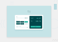
Design comparison
SolutionDesign
Solution retrospective
Any constructive criticism is welcome!. Cheers.
Community feedback
- @afrusselPosted about 3 years ago
Good work. Use main after body tag Use rem instead of px for font size
Marked as helpful1 - @DziugisLTPosted about 3 years ago
Suggest not to use a border, because it moves everything when you add a border on hover or focus. Use box-shadow: 0 0 0 {size of border you want} {color};
Marked as helpful0 - @ChamuMutezvaPosted about 3 years ago
- the layout for display shifts when calculating
- the calculations are not correct, sometimes
zero number of people is giving positive values. First enter1in the number of people and a bill of 100 - do some calculations then change the number of people to zero or just click the input box - it will revert to zero. Then do some calculations. It does the same also with a zero bill and zero number of people. - input elements are missing labels
Marked as helpful0 - @ConradMcGrifterPosted about 3 years ago
I would use a css class that gets toggled with JS to display the selected tip % styles instead of using the
:focuspseudo class. The problem with:focusis that if I click off the button it removes the styles and I no longer know which tip % is being usedother than that it looks really good. nice work!
Marked as helpful0
Please log in to post a comment
Log in with GitHubJoin our Discord community
Join thousands of Frontend Mentor community members taking the challenges, sharing resources, helping each other, and chatting about all things front-end!
Join our Discord

