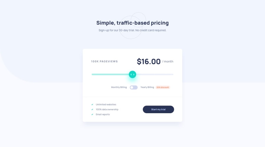
Design comparison
Solution retrospective
any way to help me improve will be welcomed, please
Community feedback
- @Moyo75Posted over 3 years ago
On mobile:
-
The subtexts in the header should be displayed vertically, not inline. You might want to use two
ptags and display them accordingly, based on desktop or mobile. -
The elements in your component are sandwiched on many mobile screen sizes and and width is comparatively smaller than in the design. I think this is due to
width: 200pxyou gave to<div class="hero_main background"></div>.
General:
-
Based on the values provided in the project requirements, you slider is not properly hooked up with pageviews count and the pricing amount as described in the readme file. This should be from your JS.
-
Your toggle slider seems out of place. You might want to adjust the
widthandheightof<label for="checkbox" class="label"></label>a bit. -
The slider thumb is probably not styled at all. You can catch it with .slider::-webkit-slider-thumb {} since you gave it a class of slider and style it accordingly.
-
<span class="discount discount-display">-25%</span>is not properly styled, you should refer to the design; the disappears on clicking the toggle button, I see not grounds for this in the project requirements. I think this is the reason why:checkbox.addEventListener('change', function(){ discount.classList.toggle('discount-display'); }) -
You might want to include a reference to yourself as the developer and also to FEM.
I believe your app can look and behave more as described in the project requirements when you fix this issues.
1 -
Please log in to post a comment
Log in with GitHubJoin our Discord community
Join thousands of Frontend Mentor community members taking the challenges, sharing resources, helping each other, and chatting about all things front-end!
Join our Discord
