

Design comparison

Solution retrospective
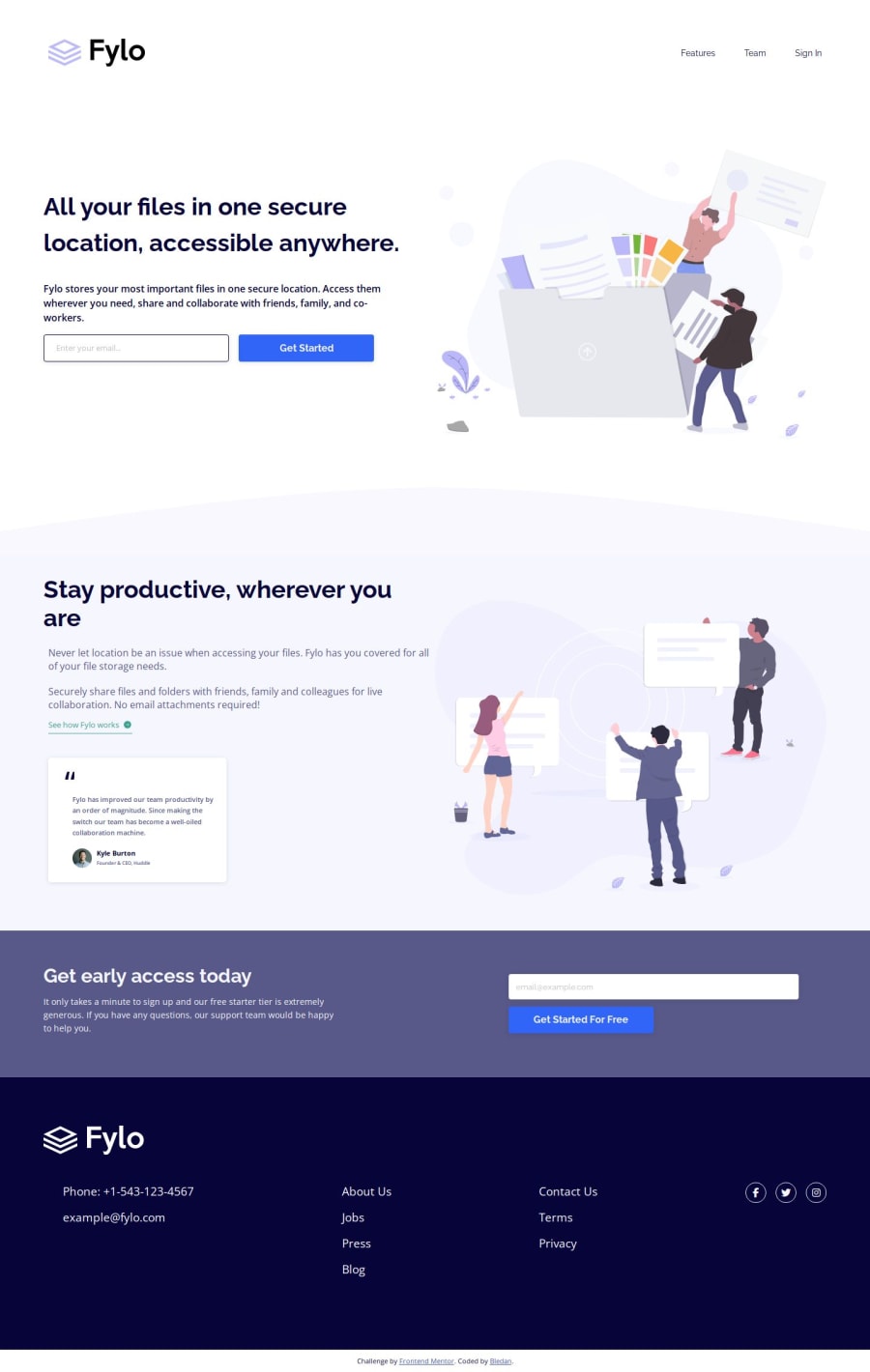
I'm proud of having managed to recreate the page as faithfully as possible but I realize my optimization process is very lacking and not everything is in the right place... I'm proud of having tried dynamic font scaling technique.
What challenges did you encounter, and how did you overcome them?This one has been hard for me... Many challenges were awaiting: the invalid input text (resolved through span::before), the green link (resolved through filter function), the overall tricky layout shift between mobile and desktop (the input placeholders were really a cruel touch!).
What specific areas of your project would you like help with?I would love to know how I can optimize this code, 600 lines is too much in my opinion... thanks!
Community feedback
Please log in to post a comment
Log in with GitHubJoin our Discord community
Join thousands of Frontend Mentor community members taking the challenges, sharing resources, helping each other, and chatting about all things front-end!
Join our Discord