Design comparison
SolutionDesign
Solution retrospective
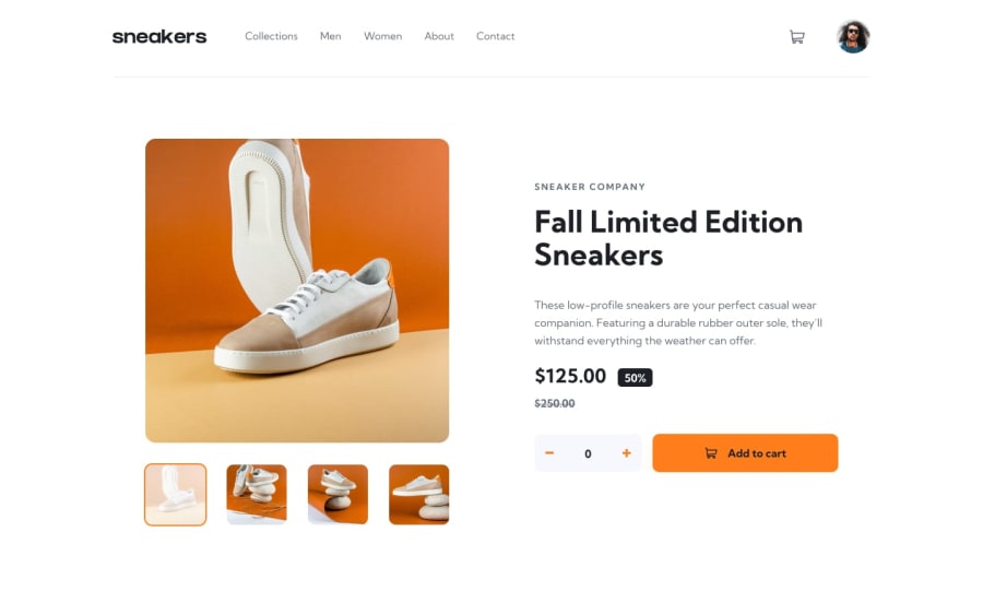
Hello guys. That's my solution to this challenge. I really liked the result I got. I used SASS for the CSS and despite the challenge not asking, I ended up adding the functionality to change the theme to dark when interacting with the Avatar image. I notice that I'm making little progress. Please, whoever has tips and tricks to improve even more, I would love to hear them to improve. Hugs and thanks.
Community feedback
Please log in to post a comment
Log in with GitHubJoin our Discord community
Join thousands of Frontend Mentor community members taking the challenges, sharing resources, helping each other, and chatting about all things front-end!
Join our Discord
