Submitted 3 months ago
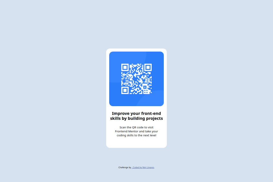
Sass compiler and variables as well as flexbox
#bem#sass/scss
@EnithLinares
Design comparison
SolutionDesign
Solution retrospective
What are you most proud of, and what would you do differently next time?
I am very proud of how well the design turned out thanks to the Figma files provided, and in the future I want learn how to achieve this layout with grid instead of flexbox.
What challenges did you encounter, and how did you overcome them?I struggle a little bit with remembering structure my HTML semantically, but I went over past projects and repeat it the pattern I used before for BEM.
Community feedback
Please log in to post a comment
Log in with GitHubJoin our Discord community
Join thousands of Frontend Mentor community members taking the challenges, sharing resources, helping each other, and chatting about all things front-end!
Join our Discord
