Design comparison
Solution retrospective
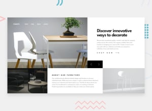
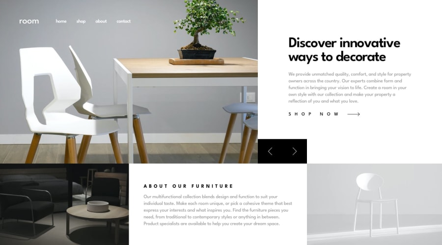
First of all, screenshot looks wrong, no spaces between title and text below, it's because I used the new flex gap property, so it isn't supported on whatever frontend mentor uses for showing screenshots.
Spent way too much time making it responsive on all possible displays. Haven't been able to animate hero panel change. Added dark theme.
Let me know what you think and if you have any tips or criticism 🐪
All these validation/html errors are all for the same element, back and forward buttons, don't be alarmed, forgot to validate it before submitting 😂 It looks like many because I ended up giving each panel its own sets of buttons, instead of all panels reusing the same, couldn't find a way to absolutely position them if they were outside of the panels. So each error produces 3. Mistake on my part.
Join our Discord community
Join thousands of Frontend Mentor community members taking the challenges, sharing resources, helping each other, and chatting about all things front-end!
Join our Discord
