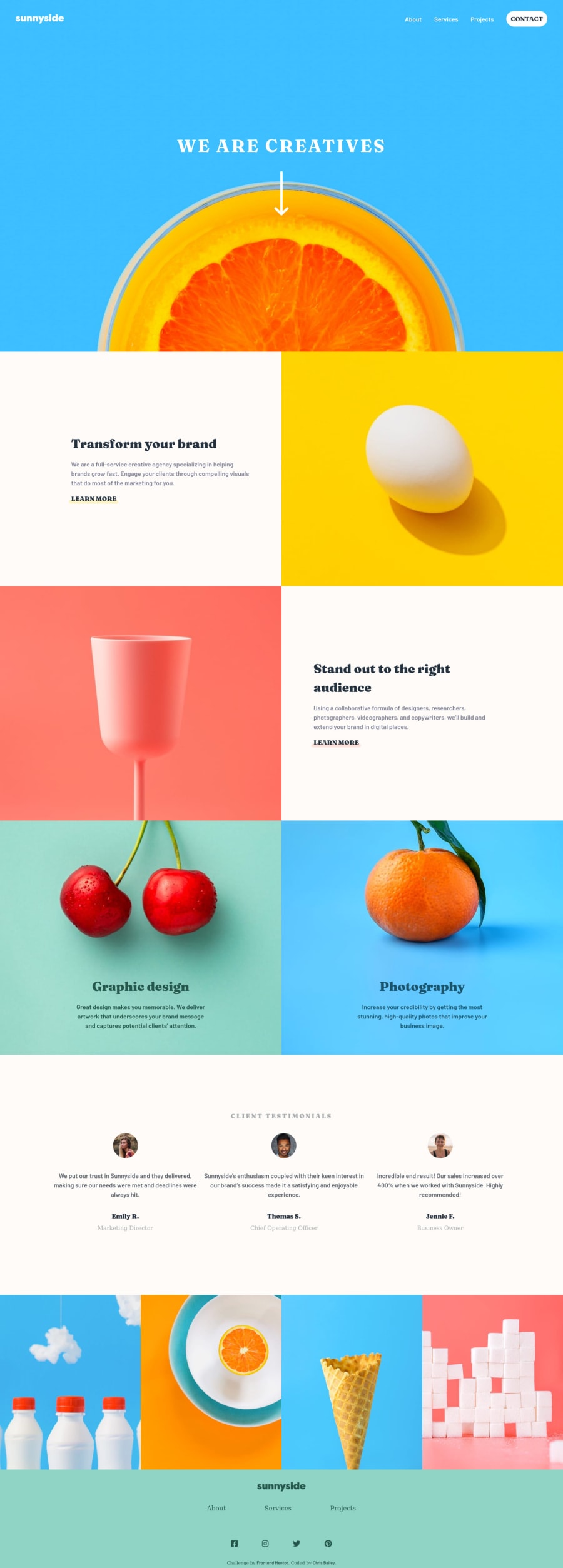
Design comparison
Solution retrospective
I quite enjoyed doing this project, I've tried to make it as accessible as possible any tips for improvement will be greatly appreciated.
Community feedback
- @tedikoPosted over 3 years ago
Hello, Chris! 👋
Congrats on finishing another challenge! 🎉 Your solution looks very good and also responds well. Here's my few tips:
- Add
:focus
pseudo class to interactive elements like anchors, buttons etc. Useoutline
property to make your website more accessible to keyboard users. Focusable elements like anchor, buttons or inputs they have applied default:focus
pseudo class withoutline
property. These default styles are subtle and hardly visible tho. Furthermore every browser has a slightly different default style for the outline, so you probably want to change the default style. Read more about why we should change focus styles. - Change the
alt
attributes for the.about__img
images, as they don't add any extra context for screen reader users. Since your images are decorative youralt
text should be provided empty (alt="") so that they can be ignored by assistive technologies.
Good luck with that, have fun coding! 💪
Marked as helpful2@chrisbailey85Posted over 3 years ago@tediko thank you, I keep forgetting about setting the focus. As a rule of thumb should you genuinely leave the alt empty unless it's has very important information on it?
0@tedikoPosted over 3 years ago@chrisbailey85 Yes, a decorative image is an image that adds visual appeal to the site without adding any additional important information. This image could strictly be a visual decoration. Read about Decorative Images. Image Accessibility 101.
1 - Add
- @soransh-singhPosted over 3 years ago
greattt workkk.... I liked your menu button and arrow icon animation ... will try to add something similar in my project... nice work...
1@chrisbailey85Posted over 3 years ago@soransh-singh thank you. My first time messing about with a little bit more animations other than the standard spin to the cross.
1 - @JulianIfesiokwuPosted over 3 years ago
Solid effort, i think you missed using the right fonts for the client job description. How did you get the underline completed on the "LEARN MORE"? Also how did you get the logo to be green in the footer? Solid effort though.
1@chrisbailey85Posted over 3 years ago@egbuna09 oops good eye, I miss that I'll go and fix that in a bit, thanks. For the underline on the learn more I've used the ::before pseudo-element on the link, and for the footer I actually created a separate SVG file and change the colour.
1@JulianIfesiokwuPosted over 3 years ago@chrisbailey85 also how did you get the mobile nav looking like it has a small triangle on the far right? I mean the small notch at the top? Dont know if it is called a notch.
0@chrisbailey85Posted over 3 years ago@egbuna09 for that one I used the ::before on the nav tag, then use the border trick to make a triangle. On my main CSS file it's on line 135 if you want to see exactly how I've done it, or check this article out on css-tricks
1
Please log in to post a comment
Log in with GitHubJoin our Discord community
Join thousands of Frontend Mentor community members taking the challenges, sharing resources, helping each other, and chatting about all things front-end!
Join our Discord