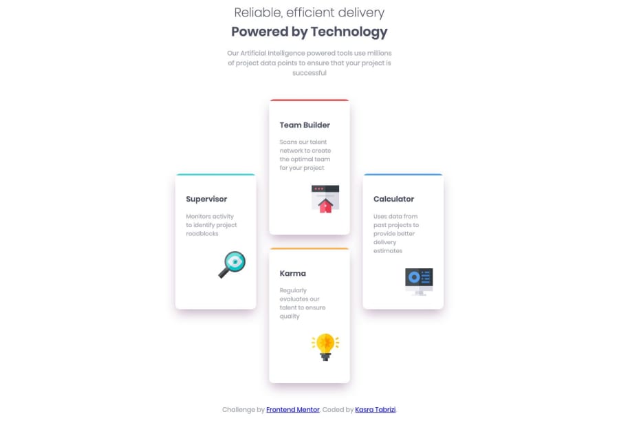
Design comparison
Community feedback
- @mattstuddertPosted about 5 years ago
Nice work on this Kasra and congrats on submitting your first solution to the platform. It looks really good! A couple of small pointers would be:
- The cards look a little squashed on the desktop layout when compared to the design. I'd recommend making them a little wider.
- I'd say the cards could switch to the grid layout earlier than
1400px. At1399pxthe items are very stretched.
Keep up the great work! I'm looking forward to seeing your next solution 👍
0@KasraTabriziPosted about 5 years ago@mattstuddert
Hi Matt,
Do you also have any tips for the design between 375px and 1440px? What do I pick? I'm also currently working on the Single Price Grid Component challenge and have created the design for 375px and 1440px. But the design between 375px and 1440px has the mobile design. at 1439px I switch to the desktop version. Is that good?
0@mattstuddertPosted about 5 years ago@KasraTabrizi I would recommend adding media query breakpoints whenever the content starts to look either too squashed or too stretched. For example, with the pricing grid challenge, I'd say
1439pxis too large and you could break to the desktop layout sooner. It's great practice to start training your eye for when you think this is. There's no one-size-fits-all approach.I hope that helps! Let me know if you have any other questions 👍
0@mattstuddertPosted about 5 years ago@KasraTabrizi no worries! I hope you enjoyed the challenge!
0@KasraTabriziPosted about 5 years ago@mattstuddert
Thx for your advice! I'll see what I can do.
0@KasraTabriziPosted about 5 years ago@mattstuddert
Hi Matt, Thanks a lot for you fast and constructive feedback!
0
Please log in to post a comment
Log in with GitHubJoin our Discord community
Join thousands of Frontend Mentor community members taking the challenges, sharing resources, helping each other, and chatting about all things front-end!
Join our Discord
