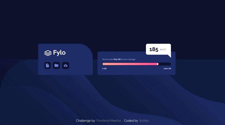
Design comparison
SolutionDesign
Solution retrospective
I'd love feedback. I know the dimensions are a bit off, but I figured I wouldn't focus so much on perfection this round and move on to something else. I also didn't try the mobile version
I had a ton of issues working with Flexbox for the first time so if anyone wants to sift through the code and critique, it would be very much welcomed! I have a lot more to learn, that's for sure!
There are two stylsheets. Main.css is minified, and style.css was run through unminify.com so it may not be the most readable. Thanks!
Community feedback
Please log in to post a comment
Log in with GitHubJoin our Discord community
Join thousands of Frontend Mentor community members taking the challenges, sharing resources, helping each other, and chatting about all things front-end!
Join our Discord
