Design comparison
SolutionDesign
Solution retrospective
i enjoyed it
Community feedback
- @MoodyJWPosted over 3 years ago
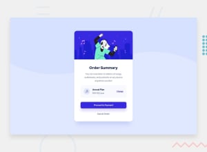
Nice job! Overall it's pretty close to the challenge, but you have a few small things I've listed below that could be improved for accuracy.
- font weight is wrong on the buttons, title, the
changelink, andannual plan; the text is bolder in the example - font color is wrong on the price, it is more subdued in the example
proceed to paymentbutton has a box shadow in the example- box around the price is more subdued in the example
- on larger screens, the card is more of a square than a rectangle, but it looks good on mobile and 1440x900 which is what the challenge wants so ¯\_(ツ)_/¯
Marked as helpful1 - font weight is wrong on the buttons, title, the
Please log in to post a comment
Log in with GitHubJoin our Discord community
Join thousands of Frontend Mentor community members taking the challenges, sharing resources, helping each other, and chatting about all things front-end!
Join our Discord
