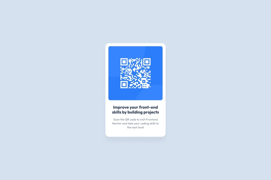
Design comparison
SolutionDesign
Solution retrospective
- The white background of the image was hard to shrink.
- The text below the QR code in sample seems to be different but when I did h1 and h4, I was not able to get the exact image.
- Please suggest on how to improve my site, With easier method.
Community feedback
- @MamoutyPosted over 2 years ago
For the text of component you should use h1 for the title and p for the text (paragraph). You'll also need to import the fonts from google fonts. You'll find the link in the style-guide.md.
Marked as helpful0@Bharath-Kumar25Posted over 2 years ago@Mamouty Hi Mahmoud. You are right. I did not get the exact style which had to be applied. But Did not know which font had to be applied. Next time I'll reduce using header/h tags since it is not a good practice. Anything else which I can improve?
0@MamoutyPosted over 2 years ago@Bharath-Kumar25 You can try reducing a little bit the height of your component. Also reduce the border-radius of both the QR code's image and body.
0
Please log in to post a comment
Log in with GitHubJoin our Discord community
Join thousands of Frontend Mentor community members taking the challenges, sharing resources, helping each other, and chatting about all things front-end!
Join our Discord
