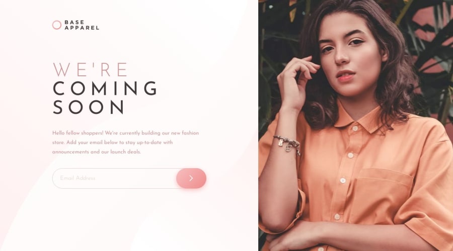
Design comparison
Solution retrospective
Hello FEM lovers,
After today's challenge, which took me around 7 hours, I know that I definitely need to practice more!
I have two things that I would like to discuss with you. Please feel free to answer one or both of them.
#1
Is there any improving advice on my RWD, which was not working perfectly? I was especially not sure about the following:
Desktop:
- .picture won't feat the 100% height of viewport
- left content I wrote 50%, and I wonder is there any more clever way to do so?
Mobile:
- background colour will not cover some part of the viewport when scrolling the page
#2
Is it okay to write the following CSS?
:root {
font-size: 1.5rem;
}
I think this is unusual, but it works. It's because I want to use em and avoid writing more code for the next media query level.
Or do you have any better ideas for achieving this challenge without using media queries?
Thank you, and have a great day :D"
Community feedback
- @KayloPortalPosted over 1 year ago
[ 💖 ] Hello! Hope you had a nice day I saw the code and I think I have some suggestions and solutions for your questions
Question #1
-
the picture is a parent to our img, If we increase the width or height of the parent, the img width doesn't change till we set it's height or width with relative units, that targets the parent properties, like "%" unit
-
But I have a better solution, instead of changing height or width of <picture>, set the width of it to 100vh or 100dvh (second one's more responsive), the parent size will change by its child
-
Now, all things will break. this is because of two things: 1/ picture has a position of absolute, it means the other containers doesn't react to its change or size or anything 2/ We don't have flex - grid for <main>
-
the solution is to set the position of <img> and <image> to relative, and put all of texts and the from and header in a <div class="content">
-
now we set these styles for <main>:
.main { display: grid; grid-template-column: 1fr max-content; }- We remove the sizes for <image> and we set the sizes for its child instead
- And also we should remove the padding set to <main> and we set new padding for .content
- For other issues you can checkout the others code, and also I suggest you to watch flex, grid and responsive webpage tutorials of kevin-powell in youtube
Question #2 No it's not a good solution, we shouldn't change rem points, also we can use modern css features like flex, grid, clamp, min, max to make our webpage responsive.
Hope it was helpful, Have a great day
Marked as helpful1@LJBL22Posted over 1 year ago@KayloPortal Thank you, Kaylo!
I checked others' codes, and instead of using a
picture, I used adiv+background-image, and it worked! Later, I saw that you wrote these helpful words!Thanks for your advice, and I can't wait to try what you shared with me in my next challenge!
Plus, I've watched Kevin Powell's videos – they are AWESOME! ;^)
1 -
Please log in to post a comment
Log in with GitHubJoin our Discord community
Join thousands of Frontend Mentor community members taking the challenges, sharing resources, helping each other, and chatting about all things front-end!
Join our Discord
