Design comparison
Community feedback
- P@Biggboss7Posted over 2 years ago
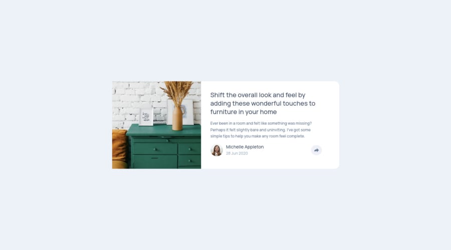
Hello @eriktoger, You did a great job on this challenge. I like how you make the share-link location appears as it is shown in the given design. However, I think that you miss a meta viewport on the HTML head section, which cause the card cannot follow the media query rules.
Hope it helpful.
Marked as helpful0@eriktogerPosted over 2 years ago@Biggboss7 Thanks! I totally missed that, since I have only tested my page in the browser using Responsive Design Mode.
I needed to add name="viewport" content="initial-scale=1" to get it to work.
It also turned out that using transform was a better way then setting right/bottom. So now it seems to work on desktop and android for Firefox/Chrome.
I haven't tested my apps on Iphone (since I dont have one).
0
Please log in to post a comment
Log in with GitHubJoin our Discord community
Join thousands of Frontend Mentor community members taking the challenges, sharing resources, helping each other, and chatting about all things front-end!
Join our Discord
