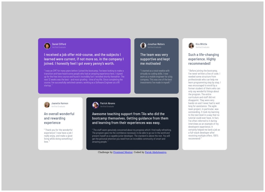
Design comparison
Solution retrospective
Any feedback will be very much appreciated.
Community feedback
- @benjoquilarioPosted over 3 years ago
Hey @faruking, great work on finishing this one. I really like your solution.
Some suggestion:
- You forgot to add the
baseor simply put areset, you must add the
font-size: 100%; box-sizing: border-box; } *, *:: before, *::after { box-sizing: inherit; padding: 0; margin: 0; }- If you want a main content of your page must add the <main> tag for a big container like this one.
- If you want to center you container add this on your body tag.
min-height: 100vh;
 display: flex;
justify-content: center;
align-items: center;
so that the your main container will center no matter what screen size.
- I'm also like you before I'm using media queries in max-width: 375px and that completely is wrong you should change it to 768px.
Aside from those everything looks good to me keep coding and happy coding too.
Marked as helpful1@farukingPosted over 3 years ago@benjoquilario thank you so much for your contribution. Everything you said is noted and will be worked on. Once again thank you. If you could shed more light on your last point regarding media queries that would be helpful.
0@benjoquilarioPosted over 3 years ago@faruking glad that help Well because your page only responsing on 375px and some people forgotten that there is some screen devices with 411px, 540px and tablet with 768px
0 - You forgot to add the
Please log in to post a comment
Log in with GitHubJoin our Discord community
Join thousands of Frontend Mentor community members taking the challenges, sharing resources, helping each other, and chatting about all things front-end!
Join our Discord
