Responsive card component using CSS custom properties and BEM


Design comparison

Solution retrospective
To have understood the basic elements of html and css. In retrospect, in the future I would like to improve my semantics and my understanding of css as well as a better handling of style guides and organization.
What challenges did you encounter, and how did you overcome them?The biggest challenge was to follow and think about how to position the elements in a clear way, to see where to put extra elements and where to remove them to make the layout easier.
What specific areas of your project would you like help with?I would like to get some advice on good css handling, in case I have repeated myself or have not used a good practice.
Community feedback
- @tobiidev21Posted 6 months ago
¡Hola, Marcos! Me gustaría realizar un aporte semántico en tu código html. Tu código contiene una etiqueta (
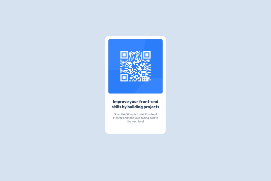
<main></main>) que engloba el componente tarjeta, dentro de la misma posees una etiqueta (<img>) y un (<div></div>). El código está correcto y podría funcionar de esta manera, pero también podría ser buena idea mejorar la semántica del mismo. Principalmente, el tamaño de la pantalla se debe ajustar para dispositivos pequeños (mobile) y pantallas más grandes (desktop). La idea sería utilizar una etiqueta (<main></main>) que se adapte a estás dimensiones y dentro crear otra etiqueta que englobe la tarjeta (card). Así puedes readaptar el fondo del componente a las dimensiones adecuadas para cada dispositivo. Por otra parte, sería maravilloso separar el componente tarjeta (card) en dos secciones con etiquetas semánticas<section> </section>: una para la imágen y otra para el texto. De esta manera, tu código será más legible y estará mejor segmentado semánticamente. Espero que mi devolución te pueda ayudar a seguir aprendiendo y mejorando. A continuación te dejaré un ejemplo de código. Saludos.<body> <main class="main-container"> <div class="card"> <section class="qr-section"> <img src="../public/image-qr-code.png" alt="QR Code"> </section> <section class="info-section"> <h1>Improve your front-end skills by building projects</h1> <p>Scan the QR code to visit Frontend Mentor and take your coding skills to the next level</p> </section> </div> </main> </body>Marked as helpful0

Please log in to post a comment
Log in with GitHubJoin our Discord community
Join thousands of Frontend Mentor community members taking the challenges, sharing resources, helping each other, and chatting about all things front-end!
Join our Discord